Figures & data
Table 1 Statistical fallacies evaluated from the 2020 election.
Fig. 1 Truth social post by former President Donald Trump re the lengths he would be prepared to go to overturn the 2020 election results.
Note: Post accessed June 16, 2023. https://truthsocial.com/@realDonaldTrump/posts/109449803240069864

Fig. 2 Votes in each county.
Note: One bar per county. Counties are ordered on the x-axis by the number of voters in each county. Most counties have very few voters (long tail on the left of the plot). Among small and modestly populated counties, Trump won a majority in most; among those with the largest populations, Biden won a majority. Even in the largest counties, there are plenty of Trump voters, and in the smallest counties, there are some Biden voters. The bottom panel shows the cumulative vote across all counties, ordered the same way as the top panel.
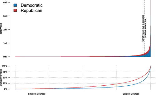
Fig. 3 Histogram of the 2020 presidential election results, by county.
Note: Both histograms consist of one bin (x-axis) each representing the Democratic share of the vote, from 0% to 100%. The top histogram shows that the majority of counties preferred Trump to Biden. (Bars include the count of counties in each bin) The bottom histogram corrects the bars so that they reflect both the number of counties in each bin, and the number of votes in each county.20 The skew is much more pronounced in the top histogram (giving the incorrect assumption that the country was heavily pro-Trump) and more approximately normal in the bottom (reflecting the true nature of the close election).20The top panel is a simple histogram. To create the bottom panel, line heights are adjusted such that the vote percentage in a county is repeated for each voter in the county, so larger counties are reflected with larger bins.
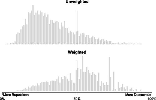
Fig. 4 Choropleth plot, 2020 presidential election by county.
Note: This choropleth map shows the 2020 Presidential election results by county. Each county is shown using the Albers projection.
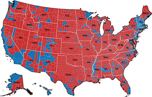
Table 2 Popular vote in counties carried by each candidate.
Fig. 5 Bubble plot, 2020 presidential election by county.
NOTE: This bubble map shows a vote-weighted representation of the 2020 election. It describes three simultaneous variables: the winner of the county, the number of votes cast, and the number of votes the county was won by. Counties colored in blue were won by Joe Biden, and those colored in red were won by Donald Trump. The size of the circle indicates the number of votes cast. The opacity indicates what the margin of victory was. Because the bubbles overlap, it can be hard to see the densest areas with many counties.
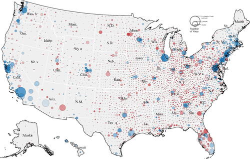
Table 3 2016 and 2020 exit polls, by race.
Table 4 Change in non-Hispanic White votes between 2016 and 2020.
Table 5 2016 And 2020 popular vote totals.
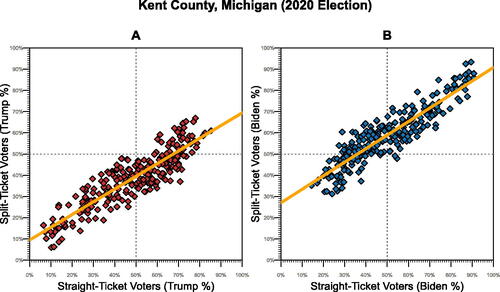
Fig. 6 Kent County, Michigan 2020 election data plotted as Ayyadurai shows it.
NOTE: Plot A shows the same data and scatterplot showing Ayyadurai’s YouTube video. Plot B shows the pattern when using Biden’s share of the vote plotted in the same manner. Each point is a precinct in Kent County, Michigan, one of the four counties analyzed in Ayyadurai’s video. 252 total precincts. The slope of the regression line in plot A is–0.40 and plot B is–0.36.
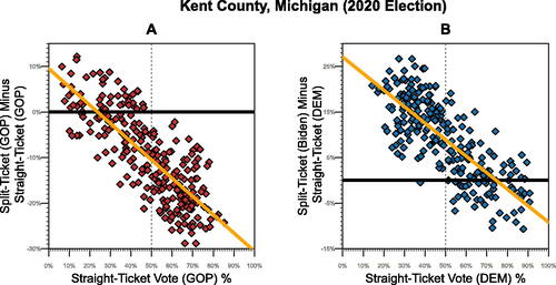
Fig. 7 Kent county, Michigan precinct comparison between Trump straight-ticket and Trump split-ticket support.
NOTE: Each point is a precinct in Kent County, Michigan, one of the four counties analyzed in Ayyadurai’s video. 252 total precincts. The slope of the regression line in plot A is 0.60 and plot B is 0.64.