Figures & data
Table 1. Inlet and outlet wastewater quality parameters of Frogn WWTP
Figure 1. (a) Schematic representation of the installation and (b) a photograph from the Frogn WWTP.
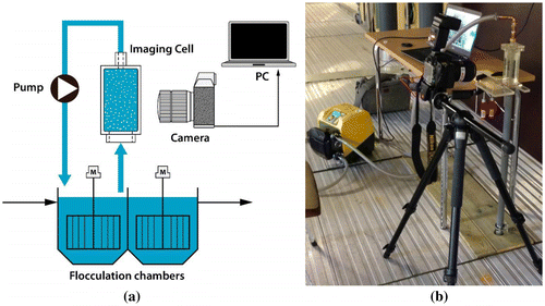
Figure 2. Graph showing the load changes in the Frogn WWTP during normal days and in rainy days. The images represent the typical floc structures for those particular days when the image analysis installation was functioning. Numbers within the each image mean the corresponding coagulant dosages in μl/l.
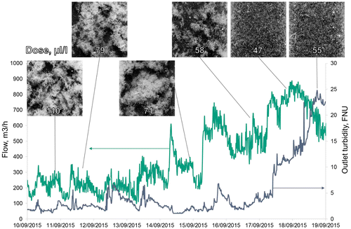
Figure 3. Scores plot of PCA, PC1 vs. PC2 for: (a) data with 9 GLCM textural features of the images of flocs; (b) data containing wastewater quality parameters, GLCM textural features and the coagulant dosage.
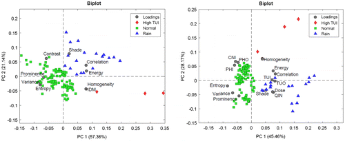
Table 2. FTI ranges for 3 classes in the data-set
Figure 4. Floc texture indexes and corresponding outlet turbidity for the obtained data-set
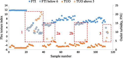
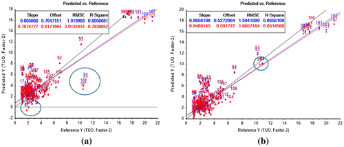
Table 3. Results of partial least squares regressions for the effluent turbidity prediction
Figure 5. Comparison of two effluent turbidity prediction models: (a) TUO = f(QIN, TUI, CNI, PHI, Dose); (b) TUO = f(QIN, TUI, Variance, Prominence, Correlation, Contrast).