Figures & data
Figure 1. Image of the length of time until a reminder is sent and the probability of purchase. The difference between the treatment group and the control group is the effect of the reminder.
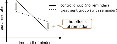
Figure 2. The overall architecture diagram. Based on the Data Flow Diagram (DFD), the arrows represent input and output, vertical lines indicate data, circles represent processes, and below, the tools used are shown.
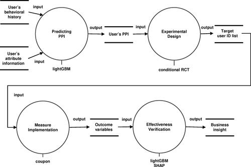
Figure 3. Image of grouping users based on PPI and assigning experimental conditions. Using two types of PPI, divide into nine groups and assign the conditions of no coupon and coupon available within them.
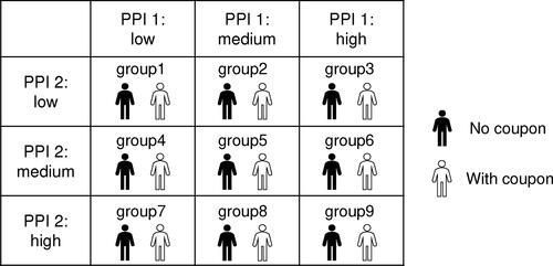
Table 1. Number of users for each group and each condition.
Figure 4. Comparison result of the average treatment effect between the treatment and control groups using propensity score matching. A darker color in the figure indicates that the measure was more effective. *the values on the axis are hidden for convenience.
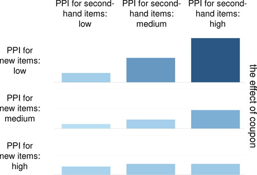
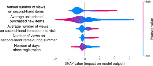
Figure 5. Results of the analysis of the effects of each covariate on the outcome variable using model-based validation. The top five variables and their SHAP values, which were determined to have a significant effect on the objective variable by SHAP.