Figures & data
Figure 1. Cost of capital perspective.
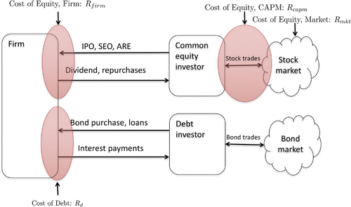
Table 1. Variable definitions
Table 2. Exclusions and rationale
Table 3. Descriptive statistics
Table 4. Cross section summary statistics
Figure 2. Leverage and cost of debt over time for all sectors.
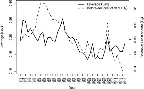
Figure 3. Leverage and cost of debt cross section box plot. Note: the middle of the box plot represents the median value. Notes: The left and right box “hinges” represent the lower 25% and upper 75% quartile, respectively. The upper and lower notch edges represent the median where IQR is the inter-quartile range (difference between 75 and 25% quartile) and n is the number of observations. The upper “whisker” extends to the minimum of the largest value and the
. The lower “whisker” extends to the maximum of the smallest value and the
. Observations beyond whisker ends are outliers and plotted as points.
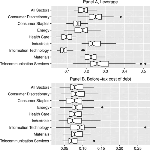
Figure 4. Cost of equity cross section box plot. Note: The middle of the box plot represents the median value. The left and right box “hinges” represent the lower 25% and upper 75% quartile, respectively. The upper and lower notch edges represent the median where IQR is the inter-quartile range (difference between 75 and 25% quartile) and n is the number of observations. The upper “whisker” extends to the minimum of the largest value and the
. The lower “whisker” extends to the maximum of the smallest value and the
. Observations beyond whisker ends are outliers and plotted as points.
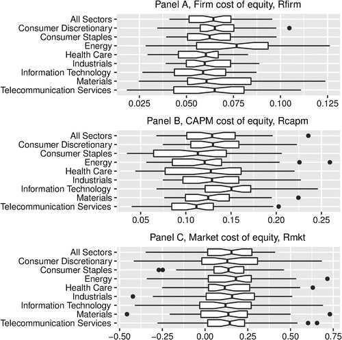
Figure 5. WACC cross section summary.
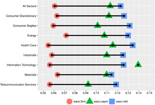
Figure 6. WACC cross section box plot. Note: The middle of the box plot represents the median value. The left and right box “hinges” represent the lower 25% and upper 75% quartile, respectively. The upper and lower notch edges represent the median where IQR is the inter-quartile range (difference between 75 and 25% quartile) and n is the number of observations. The upper “whisker” extends to the minimum of the largest value and the
. The lower “whisker” extends to the maximum of the smallest value and the
. Observations beyond whisker ends are outliers and plotted as points.
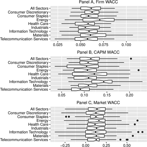
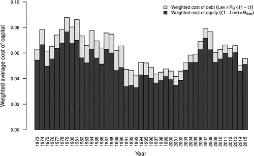
Figure 7. Firm weighted average cost of capital over time.