Figures & data
Table 1. Various commodity jump models
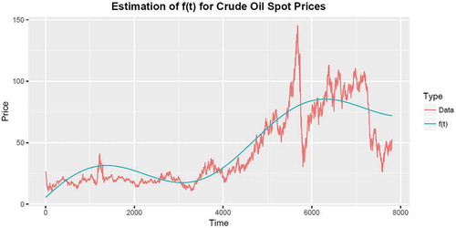
Figure 1. The top graph shows a plot of a stable process and the bottom graph shows its inverse process
simulated using exponent parameter value,
, plotted against time on the horizontal.
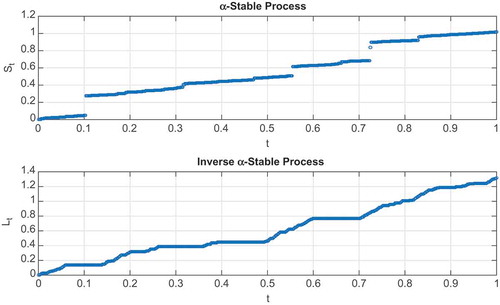
Figure 2. The graphs represent densities of an -stable process for different values of the exponent parameter,
. Observe the variation in the tail sizes and the skewness as the exponent parameter is varied.
![Figure 2. The graphs represent densities of an α-stable process for different values of the exponent parameter, α ∈(0,2]. Observe the variation in the tail sizes and the skewness as the exponent parameter is varied.](/cms/asset/c4141b2b-f629-46cc-a52a-d4ad0828d457/oaef_a_1512360_f0002_c.jpg)
Figure 3. Seasonality is captured by the function defined in the following table. The best fit of
can be obtained by obtaining an optimal set of the
parameters.
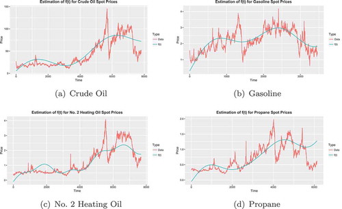
Table 2. Estimation of parameters in the seasonality function
Table 3. Parameters obtained from maximum likelihood method
Table 4. A snapshot of the structure of the data used
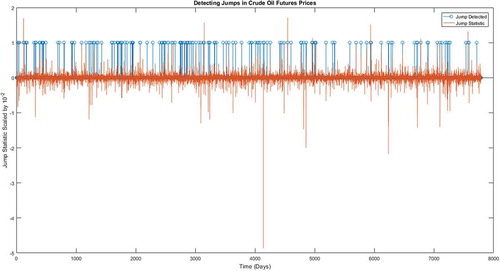
Figure 4. Detection of jumps in crude oil future prices.
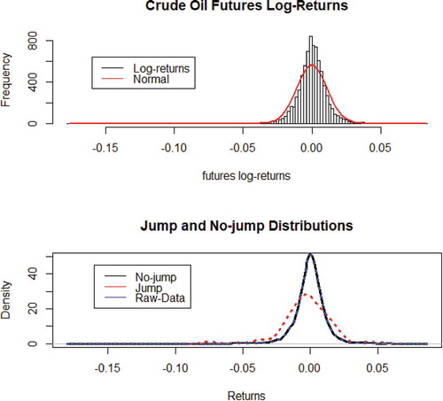
Figure 5. The large spikes in the jump statistic graph reflect the extreme events in the price where as the blue strips represent the smaller jumps that might go unnoticed. The former jumps are easily detected in returns yet the latter are not that visible.