Figures & data
Table 1. Literature summary for SACU countries
Table 2. Descriptive statistics
Table 3. Correlation estimate between interest rates and inflation
Table 4. Preliminary estimates between interest rates and inflation
Figure 1. Time series and WPS plot for interest rates in South Africa.
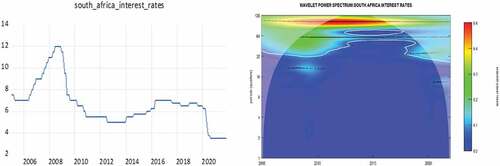
Figure 2. Time series and WPS plot for interest rates in Botswana.
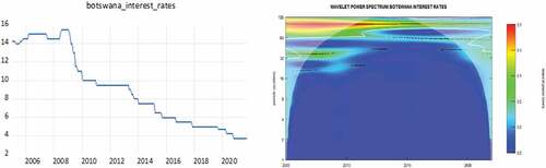
Figure 3. Time series and WPS plot for interest rates in Lesotho.
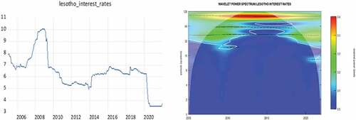
Figure 4. Time series and WPS plot for interest rates in Namibia.
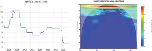
Figure 5. Time series and WPS plot for interest rates in Eswatini.
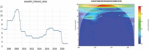
Figure 6. Time series and WPS plot for inflation in South Africa.
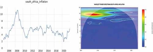
Figure 7. Time series and WPS plot for inflation in Botswana.
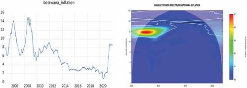
Figure 8. Time series and WPS plot for inflation in Lesotho.
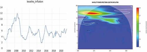
Figure 9. Time series and WPS plot for inflation in Namibia.
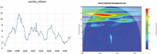
Figure 10. Time series and WPS plot for inflation in Eswatini.
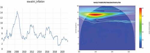
Figure 11. Time series and wavelet coherence plot for inflation and interest rates in South Africa.
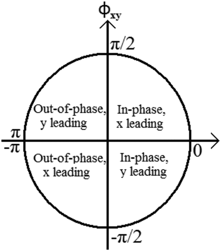
Figure 12. Time series and wavelet coherence plot for inflation and interest rates in Botswana.
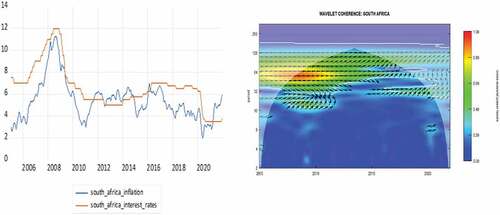
Figure 13. Time series and wavelet coherence plot for inflation and interest rates in Lesotho.
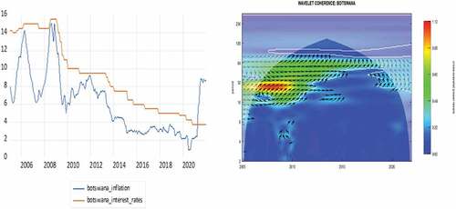
Figure 14. Time series and wavelet coherence plot for inflation and interest rates in Namibia.
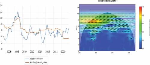
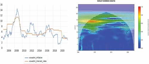
Figure 15. Time series and wavelet coherence plot for inflation and interest rates in Eswatini.
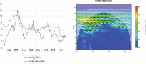
Figure 16. Diagram of phase dynamics.