
Figures & data
Table 1. Descriptive statistics
Figure 1. The left-hand side of plot represents the wavelet coherence between remittance and GDP. Right-hand position plots of partial wavelet coherence show remittance and GDP, removing the effect of exchange rates. The crosshatch reveals regions within the cone of influence (COI). The thick gray contour signifies the 95% confidence level. Arrows on the right-hand side suggest the comparative phase connection, leftward arrows represent antiphase, and upward pointing arrows imply remittance as leading.
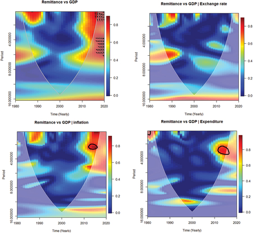
Figure 1. Continued.
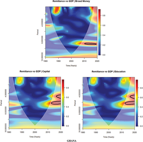
Figure 2. The left-hand side of the WC plot shows remittance and GDP. The right-hand side represents the PWC plot between remittance and GDP, removing the effect of exchange rates. The crosshatch reveals regions within the cone of influence (COI). The thick gray curve denotes the 95% confidence degree. Where arrows on the left-hand side reveal the comparative phase connection, a right-pointing arrow represents in-phase, upward pointing arrows suggest the leading of remittance, and pointing directly down implies the leading of GDP.
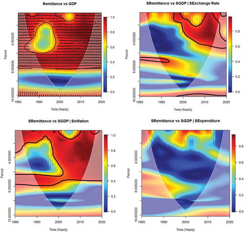
Figure 2. Continued.
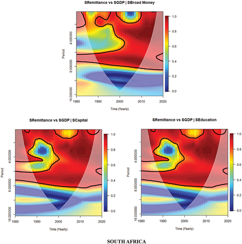
Figure 3. The left-hand side of the WC plot shows the remittance and GDP relationship. Right-hand side shows the PWC plots for remittance and GDP, removing the effect of exchange rates. The crosshatch signifies regions inside the cone of influence (COI). The thick gray curve suggests the 95% confidence point. The right-hand side arrows reveal the comparative phase connection; arrows pointing left suggest antiphase and arrows pointing straight up imply the leading of remittance.
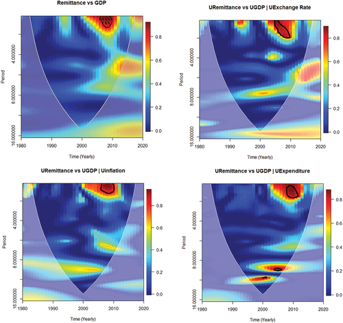
Figure 3. Continued.
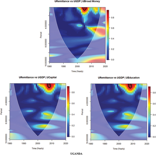
Figure 4. The left-hand side of the WC plot shows the remittance and GDP relationship. The right-hand side shows the PWC plots of Remittance and GDP, removing the effect of exchange rates. The crosshatch signifies regions inside the cone of influence (COI). Thick gray curve suggests the 95% confidence point. On the left-hand side arrows reveal the comparative phase connection; arrows pointing right suggest in-phase and arrows pointing straight up implies remittance leads and pointing straight down indicates GDP lead.
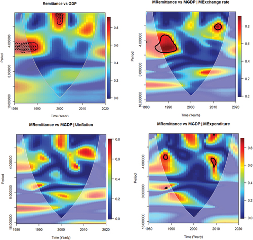
Figure 4. Continued.
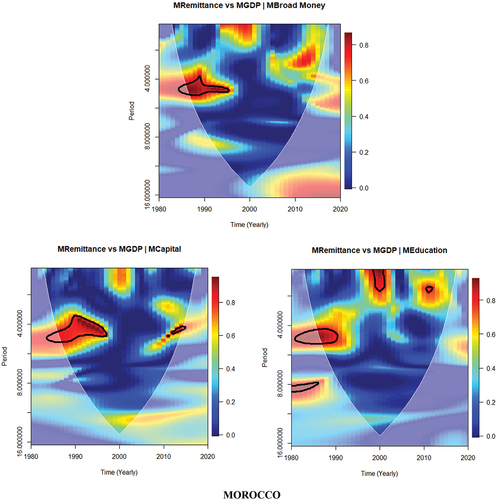
Table A1. Linear granger causality test results
Nonlinear Granger causality estimated results
Selected variables