
Figures & data
Table 1. A summary of the selected articles on the innovation-CO2 emissions nexus based on different regions.
Table 2. Definition of variables and data sources.
Table 3. Descriptive statistics.
Table 4. Unit root analysis.
Table 5. Lag length criteria.
Table 6. ARDL bounds test analysis.
Table 7. Diagnostic statistics tests.
Table 8. Dynamic ARDL simulations analysis.
Figure 1. The impulse response plot for scale effect (economic growth) and CO2 emissions.
It shows a 10% increase and a decrease in scale effect and its influence on CO2 emissions where dots specify average prediction value. However, the dark blue to light blue line denotes 75, 90, and 95% confidence interval, respectively.
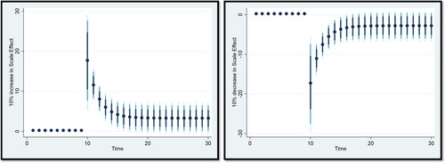
Figure 2. The impulse response plot for technique effect and CO2 emissions.
It shows a 10% increase and a decrease in technique effect and its influence on CO2 emissions where dots specify average prediction value. However, the dark blue to light blue line denotes 75, 90, and 95% confidence interval, respectively.
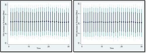
Figure 3. The impulse response plot for trade openness and CO2 emissions.
It shows a 10% increase and a decrease in trade openness and its influence on CO2 emissions where dots specify average prediction value. However, the dark blue to light blue line denotes 75, 90, and 95% confidence interval, respectively.
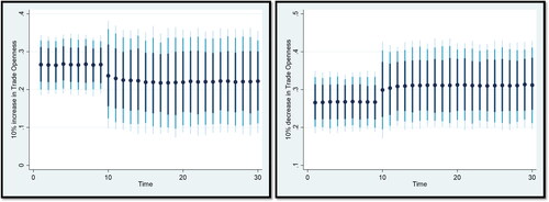
Figure 4. The impulse response plot for energy consumption and CO2 emissions.
It shows a 10% increase and a decrease in energy consumption and its influence on CO2 emissions where dots specify average prediction value. However, the dark blue to light blue line denotes 75, 90, and 95% confidence interval, respectively.
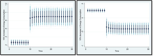
Figure 5. The impulse response plot for foreign direct investment and CO2 emissions.
It shows a 10% increase and a decrease in foreign direct investment and its influence on CO2 emissions where dots specify average prediction value. However, the dark blue to light blue line denotes 75, 90, and 95% confidence interval, respectively.
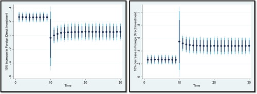
Figure 6. The impulse response plot for technological innovation and CO2 emissions.
It shows a 10% increase and a decrease in technological innovation and its influence on CO2 emissions where dots specify average prediction value. However, the dark blue to light blue line denotes 75, 90, and 95% confidence interval, respectively.
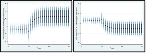
Figure 7. The impulse response plot for urbanization and CO2 emissions.
It shows a 10% increase and a decrease in urbanization and its influence on CO2 emissions where dots specify average prediction value. However, the dark blue to light blue line denotes 75, 90, and 95% confidence interval, respectively.
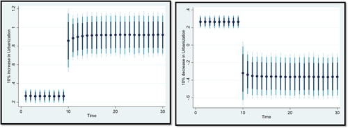
Table 9. Frequency-domain causality test.
Figure 8. The impulse response plot for industrial value-added and CO2 emissions.
It shows a 10% increase and a decrease in industrial value-added and its influence on CO2 emissions where dots specify average prediction value. However, the dark blue to light blue line denotes 75, 90, and 95% confidence interval, respectively.
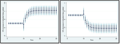
Figure 9. Plot of cumulative sum of recursive residuals (CUSUM).
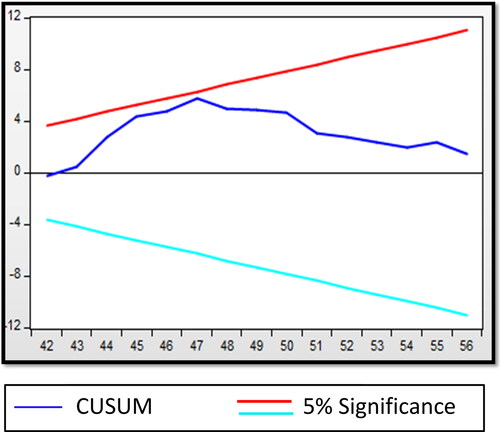
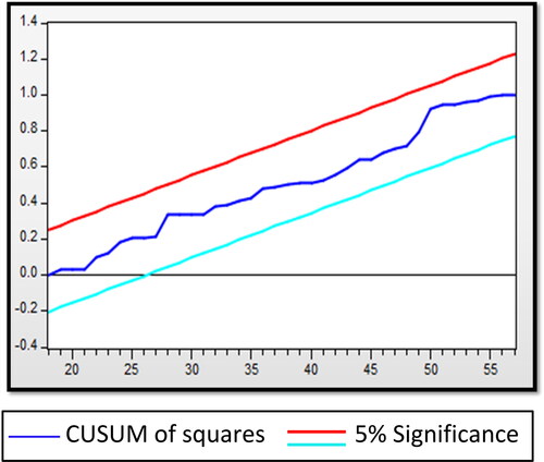
Figure 10. Plot of cumulative sum of squares of recursive residuals (CUSUMSQ).
Availability of data and materials
The datasets used are publicly available from the World Bank World Development Indicators, which can be accessed at https://databank.worldbank.org/source/world-develop ment-indicators