
Figures & data
Figure 1. The different tracks in higher education and their annual fees.
Note: These fees are estimates from 2010. The currency is US Dollar.
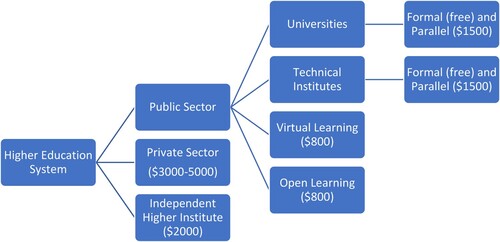
Figure 2. Data analysis steps and strategies.
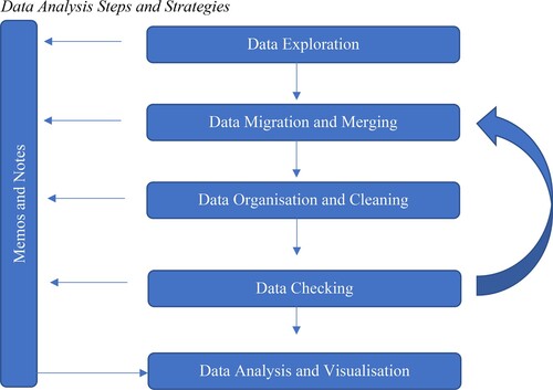
Figure 3. UG studies average graduation rate per track. Source: aggregated from the MoHE database from the year 2005 to 2015.
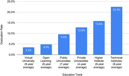
Table 1. Student-teacher ratio for the public and private sectorTable Footnotea.
Table 2. Individual courses graduation rates.
Table 3. Students/teacher Ratios for UG Studies (2001–2015).
Figure 4. Location of public Universities before 2013.
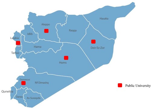
Table 4. A comparison between city-based population and city-based access to HE (2009–2012).
Table 5. Faculties distribution across cities and access representation (2008–2013).
Table 6. Percentage of total numbers of females and males accessing and graduating from HE.
Table 7. A comparison of females’ access rate in HE.
Table 8. Total access percentage of male and female students in UG and PG specialisations (2001–2015).
Table 9. Percentage of females and males in the HE labour force.
Table 10. Percentage of male/female students sent abroad via scholarships to study towards Ph.D.