
Figures & data
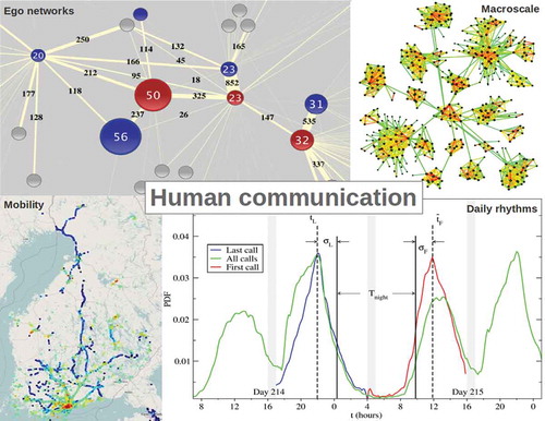
Figure 1. A part of a network constructed from mobile phone call data. Blue circles correspond to male and red circles to female subscribers. The numbers inside a circle (and also its size) indicates the age of the subscriber. Grey circles correspond to subscribers whose gender and age information is not available in the dataset. The numbers on a link (as well as its width) indicates the total number of calls between the connected pair of individuals over a period of seven months. This figure is adopted from [Citation35] and it is licensed under a Creative Commons Attribution-NonCommercial-ShareAlike 3.0 Unported License https://creativecommons.org/licenses/by-nc-sa/3.0/.
![Figure 1. A part of a network constructed from mobile phone call data. Blue circles correspond to male and red circles to female subscribers. The numbers inside a circle (and also its size) indicates the age of the subscriber. Grey circles correspond to subscribers whose gender and age information is not available in the dataset. The numbers on a link (as well as its width) indicates the total number of calls between the connected pair of individuals over a period of seven months. This figure is adopted from [Citation35] and it is licensed under a Creative Commons Attribution-NonCommercial-ShareAlike 3.0 Unported License https://creativecommons.org/licenses/by-nc-sa/3.0/.](/cms/asset/18ebb39c-8b30-47bc-879e-050ef342911d/tapx_a_1527723_f0001_oc.jpg)
Figure 2. Schematic diagram of the model by [Citation49]. (a): In a time interval , a weighted local search starts from i and proceeds to j and then to k, which is a also a neighbour of i. (b): the local search from
ends to
, which is not a neighbour of
. In this case link
is set with probability
. (c): node
creates a link randomly to a random node
with probability
. In the cases of (a) and (b) the involved links weights are increased by
. This figure is adopted from [Citation49] and it is licensed under a APS Reuse and Permissions License.
![Figure 2. Schematic diagram of the model by [Citation49]. (a): In a time interval Δt, a weighted local search starts from i and proceeds to j and then to k, which is a also a neighbour of i. (b): the local search from i ends to k′, which is not a neighbour of i. In this case link wik′ is set with probability pΔΔt. (c): node i creates a link randomly to a random node l with probability prΔt. In the cases of (a) and (b) the involved links weights are increased by δ. This figure is adopted from [Citation49] and it is licensed under a APS Reuse and Permissions License.](/cms/asset/e71c3113-81f4-4407-9fa4-2f20f8e45043/tapx_a_1527723_f0002_oc.jpg)
Figure 3. Simulated networks in the model by [Citation49], with (a) , (b)
, (c)
, and (d)
. Link colours change from green (weak links) to yellow and red (strong links). With increase in the value of
, community structure starts appearing. This figure is adopted from [Citation49] and it is licensed under a APS Reuse and Permissions License.
![Figure 3. Simulated networks in the model by [Citation49], with (a) δ=0, (b) δ=0.1, (c) δ=0.5, and (d) δ=1. Link colours change from green (weak links) to yellow and red (strong links). With increase in the value of δ, community structure starts appearing. This figure is adopted from [Citation49] and it is licensed under a APS Reuse and Permissions License.](/cms/asset/914e26f5-afb6-4fc1-bf89-9f242dfed011/tapx_a_1527723_f0003_oc.jpg)
Figure 4. Quantifying the dependence of the duration of the succeeding call (, measured in seconds) on the inter-call gap (
, measured in number of days) for pairs of regularly communicating individuals. The coefficients resulting from the regression:
, are shown.
is the coefficient when both the duration and the gap are scaled by their respective averages. A broad distinction into four groups (as indicated on the top of the columns) is done based on whether for a given pair the distance between their locations is less or greater than 30 km (i.e. geographically ‘close’ or ‘distant’, respectively) which being the spatial extension of large cities; and whether average gap,
is less or greater than 12 days (i.e. communication is ‘frequent’ or ‘infrequent’) which being the most probable inter-call gap. A finer classification is made based on the gender of the individuals as indicated along the horizontal axis (FF: female-female, MM: male-male, FM: mixed). Pairs are chosen irrespective of their age. The dashed line is a guide to the eye. This figure is adopted from [Citation60] and it is licensed under a Creative Commons Attribution 4.0 International License (http://creativecommons.org/licenses/by/4.0/).
![Figure 4. Quantifying the dependence of the duration of the succeeding call (T, measured in seconds) on the inter-call gap (τ, measured in number of days) for pairs of regularly communicating individuals. The coefficients resulting from the regression: T=βlogτ+α, are shown. β′ is the coefficient when both the duration and the gap are scaled by their respective averages. A broad distinction into four groups (as indicated on the top of the columns) is done based on whether for a given pair the distance between their locations is less or greater than 30 km (i.e. geographically ‘close’ or ‘distant’, respectively) which being the spatial extension of large cities; and whether average gap, ⟨τ⟩ is less or greater than 12 days (i.e. communication is ‘frequent’ or ‘infrequent’) which being the most probable inter-call gap. A finer classification is made based on the gender of the individuals as indicated along the horizontal axis (FF: female-female, MM: male-male, FM: mixed). Pairs are chosen irrespective of their age. The dashed line is a guide to the eye. This figure is adopted from [Citation60] and it is licensed under a Creative Commons Attribution 4.0 International License (http://creativecommons.org/licenses/by/4.0/).](/cms/asset/1ac2a6b3-7af7-43fe-94c7-f2effae3cb93/tapx_a_1527723_f0004_oc.jpg)
Figure 5. Spatio-temporal patterns studied from data collected from subjects in Finland in the Otasizzle project for a period spanning 16 months [Citation42,Citation76]. There were around 180 subjects, who were either students or staff members of the Aalto University, Finland, and were using Nokia Symbian smartphones with pre-installed software. (a) Probability distribution of inter-event times () for web domain visits by all users. The peaks in the original distribution occur due to automatic events by the browser. (b) Positional stamps of mobile phone communication of the subjects at cell towers located around Finland. The stamps got recorded every half an hour, or whenever a phone got connected to a new cell tower. Each cell tower could be located with a unique pair of latitude and longitude degrees. The higher the frequency of usage, the warmer the colour. The spatial trajectory of an individual user could be determined by following the sequence of the towers used. (c) Locations and service usage patterns of a sample user during typical Friday and Saturday. The first and second rows represent cells and contexts assigned to cells like home, office, other meaningful place, and elsewhere. Service usage events are denoted by vertical lines in the rows of web, app, email, call and SMS (from the third row to the bottom). This figure is a combination of figures from [76] and is under a Creative Commons Attribution License (http://creativecommons.org/licenses/by/2.0).
![Figure 5. Spatio-temporal patterns studied from data collected from subjects in Finland in the Otasizzle project for a period spanning 16 months [Citation42,Citation76]. There were around 180 subjects, who were either students or staff members of the Aalto University, Finland, and were using Nokia Symbian smartphones with pre-installed software. (a) Probability distribution of inter-event times (P(τ)) for web domain visits by all users. The peaks in the original distribution occur due to automatic events by the browser. (b) Positional stamps of mobile phone communication of the subjects at cell towers located around Finland. The stamps got recorded every half an hour, or whenever a phone got connected to a new cell tower. Each cell tower could be located with a unique pair of latitude and longitude degrees. The higher the frequency of usage, the warmer the colour. The spatial trajectory of an individual user could be determined by following the sequence of the towers used. (c) Locations and service usage patterns of a sample user during typical Friday and Saturday. The first and second rows represent cells and contexts assigned to cells like home, office, other meaningful place, and elsewhere. Service usage events are denoted by vertical lines in the rows of web, app, email, call and SMS (from the third row to the bottom). This figure is a combination of figures from [76] and is under a Creative Commons Attribution License (http://creativecommons.org/licenses/by/2.0).](/cms/asset/bab879a0-834c-45e5-8ed3-96e3a15212ca/tapx_a_1527723_f0005_oc.jpg)
Figure 6. Probability distribution functions (PDF) of finding an outgoing call at a time of the day in a city, for a pair of consecutive days in a given year. (Green) Distribution when all calls are included. (Red) Distribution when only the last call (L) at night is included (between 5:00 pm and 4:00 am next day). (Blue) Distribution when only the first call (F) of the day is included (between 5:00 am and 4:00 pm). The respective mean times,
and
, and the standard deviations
and
are calculated. A period of low calling activity is defined as the region bounded by
and
, and its width
is calculated as the time interval between
and
. Interestingly, the onset and length of
change along the seasons, in middle of February (day 46)
is around
hours, whilst in the early August (day 214) it is
hours. This figure is adopted from [Citation126] and it is licensed under a Creative Commons Attribution 4.0 International License (http://creativecommons.org/ licenses/by/4.0/).
![Figure 6. Probability distribution functions (PDF) of finding an outgoing call at a time t of the day in a city, for a pair of consecutive days in a given year. (Green) Distribution when all calls are included. (Red) Distribution when only the last call (L) at night is included (between 5:00 pm and 4:00 am next day). (Blue) Distribution when only the first call (F) of the day is included (between 5:00 am and 4:00 pm). The respective mean times, tˉL and tˉF, and the standard deviations σL and σF are calculated. A period of low calling activity is defined as the region bounded by tˉL and tˉF, and its width Tnight is calculated as the time interval between tˉL+σL and tˉF−σF. Interestingly, the onset and length of Tnight change along the seasons, in middle of February (day 46) Tnight is around 10.5 hours, whilst in the early August (day 214) it is 9.5 hours. This figure is adopted from [Citation126] and it is licensed under a Creative Commons Attribution 4.0 International License (http://creativecommons.org/ licenses/by/4.0/).](/cms/asset/190d181e-8945-421a-96b0-5cd4eca86e5a/tapx_a_1527723_f0006_oc.jpg)
Figure 7. Periods of low calling activity or resting periods as measured from intra-day distributions of calls (): (afternoon) and
(night) for 12 different cities for 3 different days of the week (Tuesdays, Saturdays and Sundays in the left, central, and right column, respectively) in a given year. Four cities are located in one of the three different latitudinal bands centred at:
N (top);
N (middle) and
N (bottom). For cities lying around
N, the colour line associated with their times series are blue, magenta, turquoise and maroon; for cities at
N, the colours are red, orange, brown and yellow; and for cities around
N the colours are green, dark green, indigo and grey. Inside each one of the nine plots, the annual behaviour of
(lower lines) and
(upper lines) are shown, for the four different cities located at each band. On every plot,
and
show an opposite seasonal variations, with dynamics that appear to counterbalance each other, particularly on Sundays. This figure is adopted from [Citation145] and it is licensed under a Creative Commons Attribution 4.0 International License (http://creativecommons.org/ licenses/by/4.0/).
![Figure 7. Periods of low calling activity or resting periods as measured from intra-day distributions of calls (Figure 6): Tbreak (afternoon) and Tnight (night) for 12 different cities for 3 different days of the week (Tuesdays, Saturdays and Sundays in the left, central, and right column, respectively) in a given year. Four cities are located in one of the three different latitudinal bands centred at: 37∘N (top); 40∘N (middle) and 42.5∘N (bottom). For cities lying around 37∘N, the colour line associated with their times series are blue, magenta, turquoise and maroon; for cities at 40∘N, the colours are red, orange, brown and yellow; and for cities around 42.5∘N the colours are green, dark green, indigo and grey. Inside each one of the nine plots, the annual behaviour of Tbreak (lower lines) and Tnight (upper lines) are shown, for the four different cities located at each band. On every plot, Tbreak and Tnight show an opposite seasonal variations, with dynamics that appear to counterbalance each other, particularly on Sundays. This figure is adopted from [Citation145] and it is licensed under a Creative Commons Attribution 4.0 International License (http://creativecommons.org/ licenses/by/4.0/).](/cms/asset/05964684-c738-442c-9fa2-bb3aebd6b3ea/tapx_a_1527723_f0007_oc.jpg)