Figures & data
Figure 1. Location of the study area with the eight RAPELD modules in which the monitoring plots are distributed along the Volta Grande do Xingu, eastern Amazonia, Brazil.
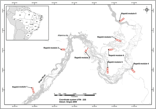
Table 1. Ten species with the highest values of carbon stock at the study area.
Table 2. Vegetation structure and dynamic per DBH class and per year of 42 hectares, showing the total value. And for carbon and biomass in parenthesis the mean and standard deviation. Carbon = carbon (Mg/ha), biomass = biomass (Mg/ha), abundance = total number of individuals, recruited = total number of recruited individuals, dead = total number of dead individuals. % represents the percentual value of each DBH class per year of the latter variable.
Figure 2. Boxplot (with quartiles and median) of carbon (Mg/ha) variation per plot between DBH classes. Letters represents statistical differences between DBH classes from ANOVA.
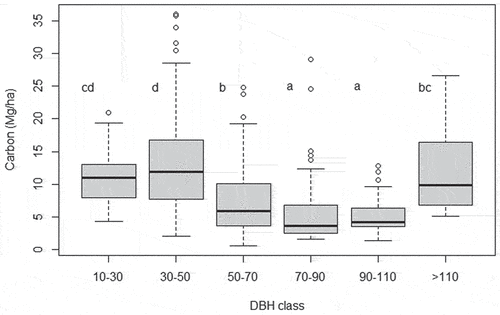
Figure 3. Boxplot (with quartiles and median) of periodic annual increment (PAI) of vegetation structure and dynamics variables.
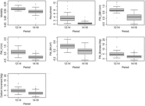
Figure 4. Boxplot (with quartiles and median) of carbon (Mg/ha) variation per plot between years. Letters represents statistical differences between years from ANOVA.
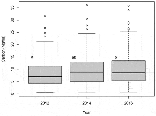
Figure 5. Carbon net per plot between the two periods: 2012–2014 (gray) and 2014–2016 (black). Y axis represents stocking (positive values) or losing (negative values) of carbon.
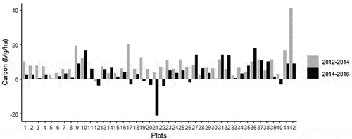
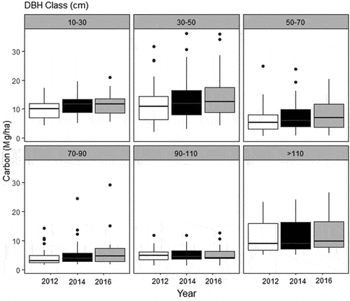
Figure 6. Boxplot (with quartiles and median) of carbon (Mg/ha) between DBH classes and years.