Figures & data
Table 1. Analyses carried out in this study and associated time periods
Figure 1. Overview of steps used to predict performance of the bioretention basin using annual rainfall measures
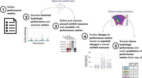
Figure 2. Flow schematic of site and model (not to scale), left, and profile view of the bio-retention layers, right. The impervious areas drain to the surface of each garden. Rain garden 1 can drain to rain garden 2 through surface runoff or under drain flow
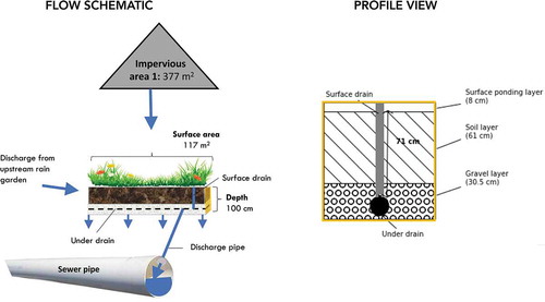
Table 2. Selected parameters of the bioretention basin (downstream) from the SWMM model
Table 3. Rainfall indices evaluated in this study. The ‘set’ column represents the different variations of each index that were tested
Figure 3. Annual rain garden performance over historical period [1983–2014] for 17 cities, including: (a) percent of runoff captured annually, (b) the volume of discharge to the sewer, (c) the frequency of these discharges, and (d) the maximum number of hours to drain the surface. The marker represents the median value across all years, the size of the marker represents the average total annual rainfall in that city, and the color of the marker represents an average annual rainfall index (listed in color bar legend). The cities are ranked based on their average total annual rainfall, from lowest to highest across the x-axis
![Figure 3. Annual rain garden performance over historical period [1983–2014] for 17 cities, including: (a) percent of runoff captured annually, (b) the volume of discharge to the sewer, (c) the frequency of these discharges, and (d) the maximum number of hours to drain the surface. The marker represents the median value across all years, the size of the marker represents the average total annual rainfall in that city, and the color of the marker represents an average annual rainfall index (listed in color bar legend). The cities are ranked based on their average total annual rainfall, from lowest to highest across the x-axis](/cms/asset/43ff37e3-14ac-4e8a-9f61-18b0c709ba73/tsri_a_1681819_f0003_oc.jpg)
Figure 4. Number of cities (out of 17) where a strong correlation exists between rainfall indices (rows) and rain garden performance metrics (columns) in the historical period [1983–2014]. The rainfall indices that have the highest number of strong correlations for each performance metric are outlined in blue
![Figure 4. Number of cities (out of 17) where a strong correlation exists between rainfall indices (rows) and rain garden performance metrics (columns) in the historical period [1983–2014]. The rainfall indices that have the highest number of strong correlations for each performance metric are outlined in blue](/cms/asset/b33189ca-0489-43f3-a161-9b1d4dc01f7a/tsri_a_1681819_f0004_oc.jpg)
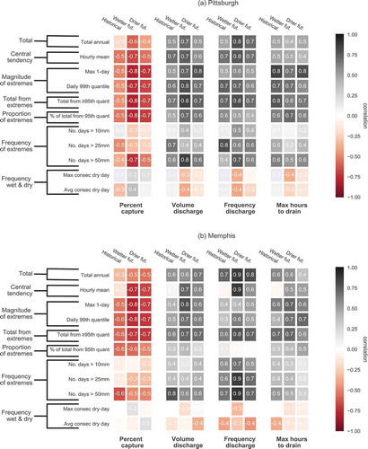
Figure 5. Correlations between rainfall indices and all performance metrics in Pittsburgh (left) and Memphis (right) for historical period [1983–2014]. Grey colors represent positive correlations, while reds represent negative correlations
![Figure 5. Correlations between rainfall indices and all performance metrics in Pittsburgh (left) and Memphis (right) for historical period [1983–2014]. Grey colors represent positive correlations, while reds represent negative correlations](/cms/asset/bdae6328-c4ce-451e-836c-c1bcdcd0aace/tsri_a_1681819_f0005_oc.jpg)
Figure 6. Rainfall indices most indicative of performance for historical period [1983-2014]. The colors for each performance metric correspond to the rainfall indices presented in
![Figure 6. Rainfall indices most indicative of performance for historical period [1983-2014]. The colors for each performance metric correspond to the rainfall indices presented in Figure 7](/cms/asset/02e234a3-a16b-4abc-a0c7-644391e144e2/tsri_a_1681819_f0006_oc.jpg)
Figure 7. Percent change in rainfall indices for two climate model simulations, drier future (orange) and wetter future (purple) in Pittsburgh (top) and Memphis (bottom). The box and whisker plots represent the range of the percent change for each year and each climate model for the future period [2020–2059], with respect to the historical period [1983–2014]. The middle line of the box plot represents the median over the 40-year future period; the box outline shows the 25th and 75th quantiles, and the whiskers show the 5th and 95th quantiles. Outliers are shown as orange dots (for the drier future) and purple stars (wetter future). The grey shading represents the historical range (in terms of percent change from the median). The black dashed line at zero represents no future change. The indices highlighted with color are those that were selected as most indicative of each performance metric, including capture efficiency (blue), volume discharged (yellow), frequency of discharge (green), and maximum drainage time (pink)
![Figure 7. Percent change in rainfall indices for two climate model simulations, drier future (orange) and wetter future (purple) in Pittsburgh (top) and Memphis (bottom). The box and whisker plots represent the range of the percent change for each year and each climate model for the future period [2020–2059], with respect to the historical period [1983–2014]. The middle line of the box plot represents the median over the 40-year future period; the box outline shows the 25th and 75th quantiles, and the whiskers show the 5th and 95th quantiles. Outliers are shown as orange dots (for the drier future) and purple stars (wetter future). The grey shading represents the historical range (in terms of percent change from the median). The black dashed line at zero represents no future change. The indices highlighted with color are those that were selected as most indicative of each performance metric, including capture efficiency (blue), volume discharged (yellow), frequency of discharge (green), and maximum drainage time (pink)](/cms/asset/396d9a79-846c-4864-bd24-634784005cf1/tsri_a_1681819_f0007_oc.jpg)
Figure 8. Predicted and simulated changes in performance metrics in the future [2020–2059] for both cities (Pittsburgh and Memphis) and both climate model scenarios (drier and wetter future) with respect to the historical period [1983–2014]. Predicted changes are based on projected changes in rainfall indices most indicative of each performance metric and simulated changes are calculated from the SWMM model simulations using climate projections. For all performance metrics except percent capture, the direction of change is equal to the direction predicted by the rainfall index. However, percent capture is inversely correlated with the associated rainfall indices, thus an increase in the associate rainfall index leads to a predicted decrease in the percent capture
![Figure 8. Predicted and simulated changes in performance metrics in the future [2020–2059] for both cities (Pittsburgh and Memphis) and both climate model scenarios (drier and wetter future) with respect to the historical period [1983–2014]. Predicted changes are based on projected changes in rainfall indices most indicative of each performance metric and simulated changes are calculated from the SWMM model simulations using climate projections. For all performance metrics except percent capture, the direction of change is equal to the direction predicted by the rainfall index. However, percent capture is inversely correlated with the associated rainfall indices, thus an increase in the associate rainfall index leads to a predicted decrease in the percent capture](/cms/asset/47c7984a-64ea-42aa-9bb3-cbab5a3ffed1/tsri_a_1681819_f0008_oc.jpg)
Figure 9. CDFs of four performance metrics (as rows), (a) percent of runoff captured, (b) volume of discharge, (c) frequency of discharge, and (d) maximum hours to drain the surface for all simulations, historical [1983–2014] (black), drier future [2020–2059] (orange), and wetter future [2020–2059] (purple), for Pittsburgh (left) and Memphis (right). The dotted lines cross the x-axis at the median value. The grey shading shows the historical range
![Figure 9. CDFs of four performance metrics (as rows), (a) percent of runoff captured, (b) volume of discharge, (c) frequency of discharge, and (d) maximum hours to drain the surface for all simulations, historical [1983–2014] (black), drier future [2020–2059] (orange), and wetter future [2020–2059] (purple), for Pittsburgh (left) and Memphis (right). The dotted lines cross the x-axis at the median value. The grey shading shows the historical range](/cms/asset/2316cf77-c097-46d7-8559-5830df2e8812/tsri_a_1681819_f0009_oc.jpg)
Table A1. Characteristics of cities used in this study
Table A2. Regional climate model simulations from NA-CORDEX used in this study
Table A3. Drainage area characteristics of SWMM model
Figure A1. View of rain garden site at East Liberty Presbyterian Church in Pittsburgh, PA. The tipping bucket rain gauge is placed behind the sign, and the CTD sensor is below ground, near the brown grate. Image source: John K. Buck, Civil & Environmental Consultants, Inc
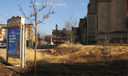
Figure A2. Summary of data from on-site sensors for precipitation (blue lines on top of figure) and volume discharged (red lines on bottom), which was calculated if water level surpassed the discharge pipe invert elevation
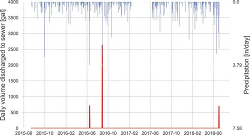
Table A4. Annual percent capture during the 4 years in the observed period calculated from observed data from on-site sensors (left column) and calculated from SWMM model simulation (right column) over the period July 2015 to July 2018
Table A5. SWMM model parameters. Parameters marked with an asterisk were adjusted to align simulated results with observed performance
Figure A3. Heat map of correlations among rainfall indices for Pittsburgh. Darker colors represent a stronger correlation between rainfall indices
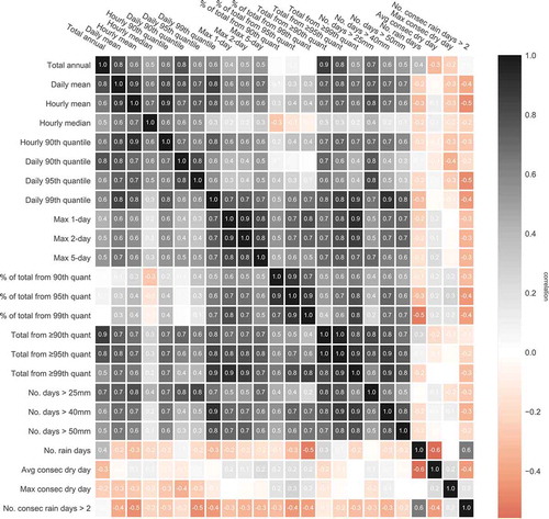
Table A6. Median rainfall indices for each climate model simulation in Pittsburgh for the future period (2020-2059)
Table A7. Median rainfall indices for each climate model simulation in Memphis for the future period (2020-2059)
Figure A4. Future range of selected rainfall indices in Pittsburgh (left) and Memphis (right) for the future period (2020 – 2059) for the four RCMs (first four boxes; 40 values each) and all values combined into a single uncertainty range (last box; 120 values)
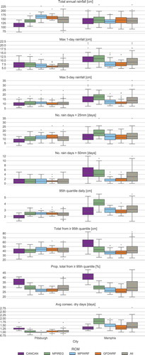
Figure A5. Correlation of selected rainfall indices to performancemetrics for the historical and future period (wetter and drier future). The top subplot (a) shows values for Pittsburgh and the bottom (b) shows values for Memphis. Grey colors represent positive correlations (from 0 to 1), while reds represent negative correlations (from 0 to —1). Labels on the left show the category of the rainfall index