Figures & data
Figure 1. Sampling localities in this study and phylogenetic relationships of Quasipaa shini. (A) Sampling localities (P1–P8) in this study. See information of populations P1–P8 in . Size of pie charts denoted beside localities is in proportion to number of samples, and different colors represent different clades/subclades. (B) Maximum likelihood tree based on COI gene sequences of haplotypes. Bootstrap supports of major nodes were denoted near them. Insert: the lower and upper frog photos are the phenotype of Clades I and II, respectively. (C) Haplotype network. The circle size is proportional to number of samples. Each subclade was surrounded by a dotted line. One white dot means one mutation step.
![Figure 1. Sampling localities in this study and phylogenetic relationships of Quasipaa shini. (A) Sampling localities (P1–P8) in this study. See information of populations P1–P8 in Table 1. Size of pie charts denoted beside localities is in proportion to number of samples, and different colors represent different clades/subclades. (B) Maximum likelihood tree based on COI gene sequences of haplotypes. Bootstrap supports of major nodes were denoted near them. Insert: the lower and upper frog photos are the phenotype of Clades I and II, respectively. (C) Haplotype network. The circle size is proportional to number of samples. Each subclade was surrounded by a dotted line. One white dot means one mutation step.](/cms/asset/8bb5c6c8-2877-44ac-ba0b-a23acbe37bb2/tmdn_a_1580154_f0001_c.jpg)
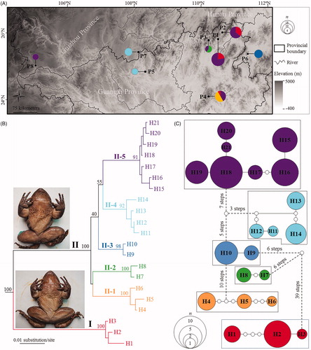
Table 1. Genetic diversity and neutrality tests of Quasipaa shini.