
Figures & data
Figure 1 Counties with truly elevated Si (i.e., spatial hot spots, stippled) and δi (i.e., spatiotemporal hot spots, hatched) in two different scenarios.
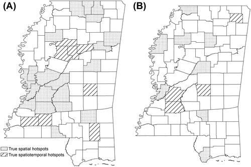
Table 1. Cross-classification based on a county’s hot spot or cold spot status of new HIV diagnoses and PrEP use
Figure 2 Mississippi state and county boundaries.
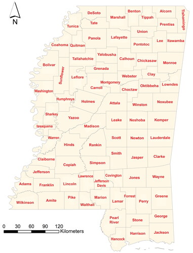
Figure 3 High proportions of suppressed values (shaded areas) in new HIV diagnosis and pre-exposure prophylaxis (PrEP) use in Mississippi, 2014–2018, using publicly accessible data from AIDSVu. First row: New HIV diagnoses per 10,000 population. Second row: Pre-exposure prophylaxis (PrEP) use per 10,000 population. Third row: Crude PrEP-to-need ratio (PnR).
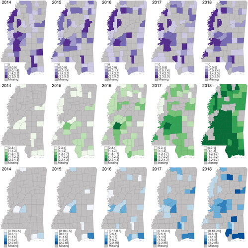
Figure 4 Main spatial patterns of new HIV diagnosis and pre-exposure prophylaxis (PrEP) use. (A1) Posterior mean (PM) of new HIV diagnosis risk (exp()). (A2) Posterior probability (PP) of having a higher risk (PP(exp(
) > 1)). (B1) PM of PrEP use (exp(
)). (B2) PP of having a higher PrEP use (PP(exp(
) > 1)). Ceased hot spots and cold spots cross-hatched in yellow; new hot spots stippled; new cold spots hatched in black.
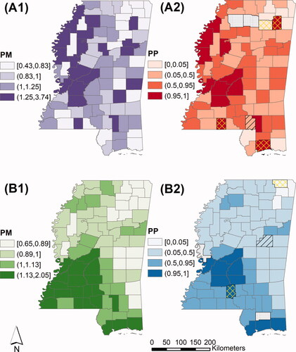
Figure 5 State-level main temporal trends of new HIV diagnoses (stable) and pre-exposure prophylaxis (PrEP) use (sharply increasing) in Mississippi (exp()), 2014–2018.
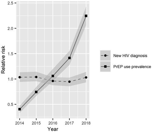
Figure 6 County-level departure trends of new HIV diagnoses and pre-exposure prophylaxis (PrEP) use from state-level trends in Mississippi (): (A1) Posterior mean (PM) of
(A2) Posterior probability (PP) of having a positive
(B1) PM of
(B2) PP of having a positive
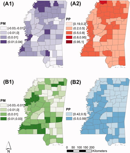
Figure 7 Temporal trends of new HIV diagnosis in Hinds and DeSoto counties, 2014–2018. Solid point: observed new HIV diagnosis rate per 10,000 population; circle: predicted new HIV diagnoses per 10,000 population; gray region: 95 percent CrI of predicted new HIV diagnosis rate; dashed line: predicted county-specific trend of new HIV diagnoses; solid line: state-level trend of new HIV diagnosis.
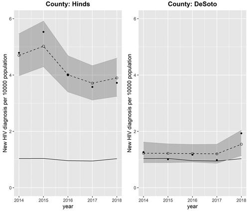
Figure 8 County classification based on hot spot/cold spot status of new HIV diagnoses and pre-exposure prophylaxis (PrEP) use. The colored dots represent PrEP-to-need ratio (PnR) hot spot or cold spot status in 2018.
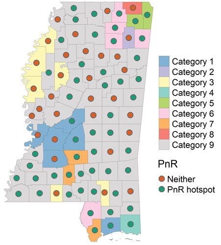
Table 2. The associations between new HIV diagnoses, pre-exposure prophylaxis (PrEP) use, and social determinants of health variables
