Figures & data
Table 1. The most Omicron suspected and confirmed cases in each area in the UK were in November and December 2021.
Figure 1. COVID-19 Epidemic modeling of the datasets. The new confirmed cases by infection date look like 5806 (between 1536 and 18,234). The effective reproduction numbers are 1.1 for 0.64 and 1.7. The rate of growth is 0.032 between – 0.032 and 0.17. Doubling or halving time (days) is 21 days. The unsure value is 0.32.
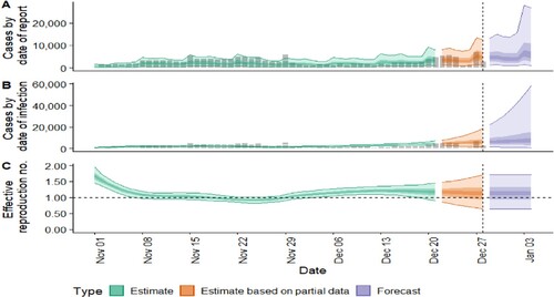
Figure 2. The Serial internal estimates from the data. It shows that it looks like to be highest incidence on December 1, 2021. The values of the mean are kpt under 4. The frequencies of the explored Sl distribution look like to be shaped waves. The highest value of frequency was 0.08.
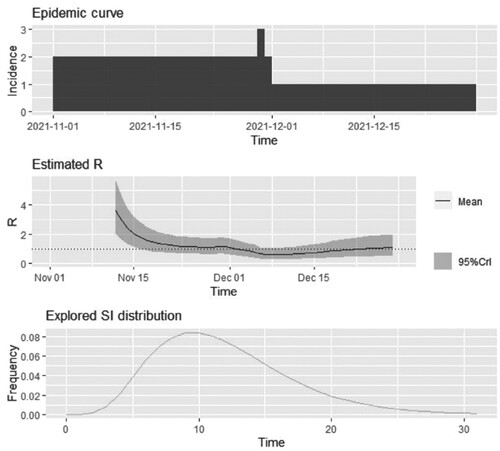
Figure 3. Overview of confirmed cases in the UK. 9 panels show the observation values, in each area in the UK. The model is a ggplot function that included specimen date (x-axis) and suspected cases of Omicron symptoms during November and December 2021 (y-axis). It looks like significant pandemic mitigation strategies. The colors are mainly used to represent 9 different research areas.
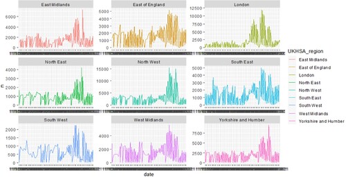
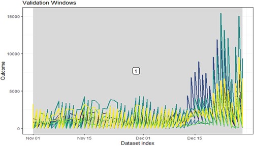
Figure 4. Forecast of datasets. We allow the model training to across all data. By this point in the modeling process, the optimal hyperparameters that gave the best performance on the outer loop validation datasets have already been identified.