Figures & data
Table I. Chronology and sites of occurrence of wedge clam (Rangia cuneata) in the Baltic Sea
Figure 1. Range of Rangia cuneata populations in the Baltic Sea since 2010 and recent location of sightings in the Pomeranian Bay and the Oder River estuary. References for observations are listed in the .
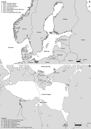
Figure 2. Age frequency distribution of live Rangia cuneata specimens collected from the Pomeranian Bay.
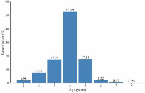
Figure 3. Length frequency distribution of live Rangia cuneata specimens collected from the Pomeranian Bay. Vertical dashed line represents mean shell length in the dataset.
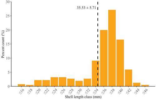
Figure 4. Length-at-age curve of Rangia cuneata collected from the Pomeranian Bay. Line represent fitted curve for the sampling site. Shaded areas represent 99% confidence intervals.
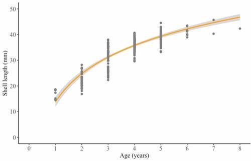
Figure 5. Haplotype network (A) and phylogenic neighbour-joining tree (B) of Rangia cuneata based on mitochondrial COI sequences.
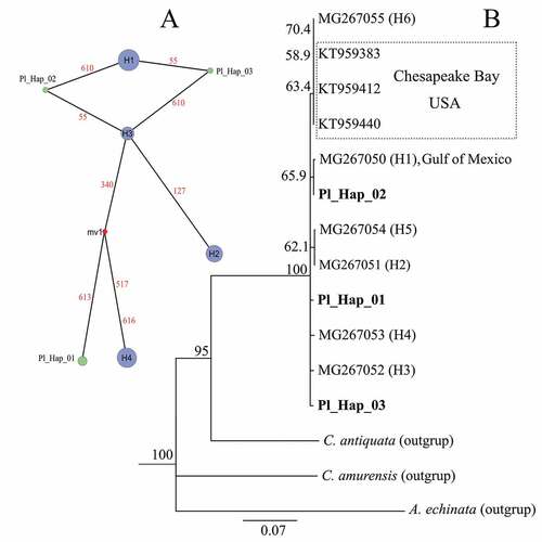
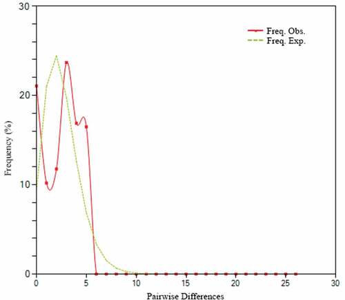
Figure 6. Mismatch distribution of pairwise differences. The X-axis represents the number of pairwise differences, and the Y-axis represents their frequency.