
Figures & data
Table I. Original abundance (species richness), percentage abundance difference for the tested dataset, number of shared species, and Bray–Curtis similarity values.
Figure 1. Similarity boxplot of Muturi et al. (Citation2006) dataset for random sub-samples of 10, 30, 100, 300, 900, 3000, 6000 individuals. The red dashed line indicates the similarity value calculated when considering the complete dataset. The plots for the other datasets are presented in the Online Resource 2.
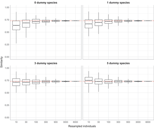
Figure 2. Barplot of mean variance ± SE of similarity for random sub-samples of 10, 30, 100, 300, 900, 3000, 6000 individuals obtained adding zero, one, three or five dummy species.
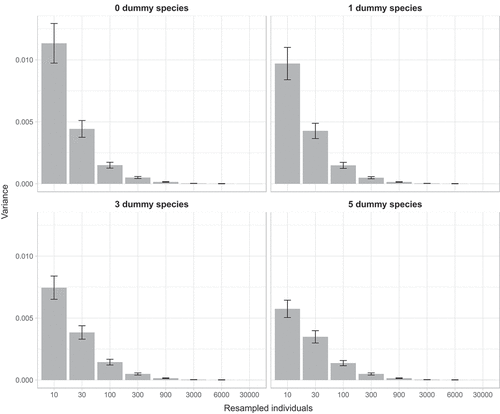
Table II. P-values of Levene’s test obtained by comparing variances estimated adding zero, one, three or five dummy species at different numbers of individuals drawn from the original dataset.
Table III. Mean values (±sd) of Good-Turing sample completeness at the increasing number of individuals resampled from the species of the original dataset.
Figure 3. Accuracy plots, which indicate the proportion of similarity values, calculated for increasing numbers of individuals drawn from the 16 datasets. Black point-ranges represent mean values (±sd) that fall within the range of ±10% around the similarity value calculated with the complete dataset; red dashed lines represent the mean rate of underestimation and blue dashed lines mean rate of overestimation.
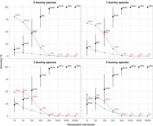
Figure 4. Mean errors on 16 datasets with an increasing number of (i) resampled individuals (left-right) and (ii) dummy species (top-down). All data are means of 1000 random draws and unbiased estimates have a mean error of zero (indicated by a red dotted line). Correlation coefficients r are reported in labels.
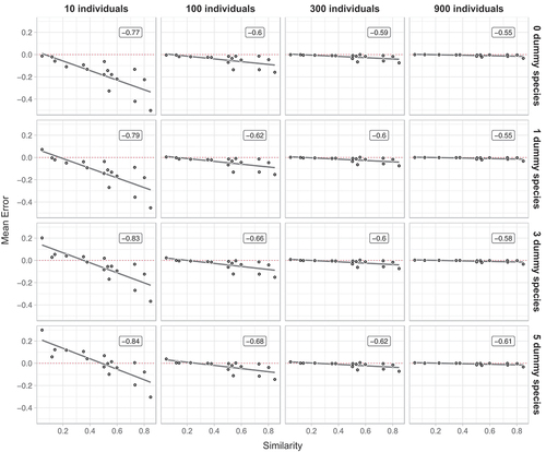
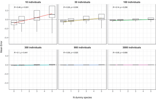
Figure 5. Boxplot of mean errors with an increasing number of dummy species and regression lines. All data are means of 1000 random draws. Correlation coefficients and P values are reported in labels.
Data availability statement
Source dataset are available in the GitHub repository “bioglp/bc2000.git” (https://github.com/bioglp/bc2000).