
Figures & data
Figure 1. Representation of the cross sections of the two flasks. The control flask (a) on the left, and the prototype flask (b) on the right have identical cross-sectional areas, but the sidewall configuration of the two flasks is different. These diagrams are intended for illustrative purposes only. They are not presented to scale, nor are they intended for manufacturing or engineering purposes. The key geometric measures of the respective flasks are presented in .
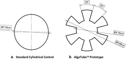
Table 1. Key Geometric Measures of the Flasks.
Figure 2. Configuration of the growth chamber. The control flask was on the left, and the prototype flask was on the right. The two light panels were affixed to the rear wall of the incubator. The incandescent light was attached to the door and centered. The magnets can be seen on the lower left side of the control flask and on the lower right side of the prototype flask. The picture was taken with the door open for convenience.
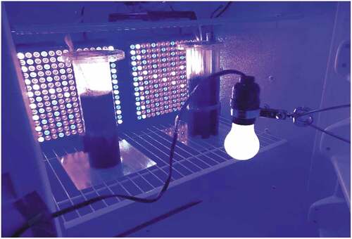
Table 2. Dilutions for % Transmittance vs. Concentration standard curve.
Figure 3. Standard Curve. This chart plots the data from the dilution table to illustrate the standard curve used to determine daily culture concentration from OD590 readings.
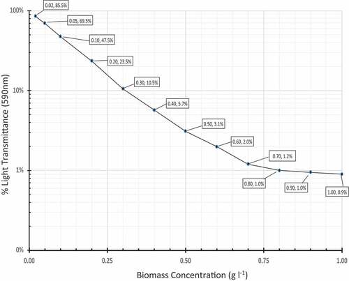
Figure 4. (A) and 4(B). Daily Concentration and Cumulative Production values of prototype and control tubes. 4(a) Chart plotting the daily Concentration (Cd), averaged across the four independent replicates, for the AlgaTube™ prototype and cylindrical control, respectively. The prototype data points are represented by solid lines and black triangles (━▲━). ΔC10 = +34% (p = 0.02, Wilcoxon Rank Sum Test). 4(b) Chart plotting the daily Cumulative Production (CPd), averaged across the four independent replicates, for the two vessels, AlgaTube™ prototype and cylindrical control, respectively. δcp10 = +41% (p = 0.02, Wilcoxon Rank Sum Test). In both 4(a) and 4(b), the prototype data points are represented by solid lines and black triangles (━▲━). The control data points are represented by dashed lines and black circles (—□—).
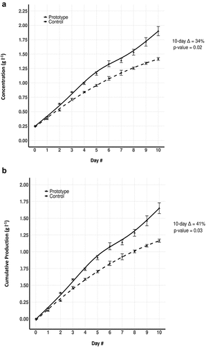
Figure 5. Time-Parsed Mean Daily Production. The Mean Daily Production (MDP) data were, themselves, averaged together longitudinally, for each of three different time periods within the 10-day experiment. The respective Delta (∆mdp) values and p-values for different time periods are shown. The mean culture concentration during each of those time periods is shown below the x axis labels. The bars representing the control flask are white, and the bars representing the prototype flask are shaded grey.
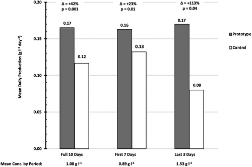
Table 3. Quantification of primary differences between present study vs. da Silva et al. (Citation2016).
Table 4. Ranked summary of all differences between present study vs. da Silva et al. (Citation2016).
Table 5. Summary of key metrics.