
Figures & data
Figure 1. Volcano map of the results of differentially expressed genes (DEGs). DEGs between 1 h (A), 6 h (B), and 12 h (C) after Brucella abortus infection and the control group. Blue dots represent DEGs, and black horizontal dashed lines indicate a false discovery rate <0.05, and the two black vertical dashed lines represent |log2 fold change| >0.5.
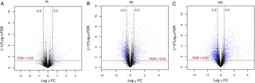
Figure 2. The Venn diagram compares differentially expressed genes at 1, 6, and 12 h after Brucella abortus infection.
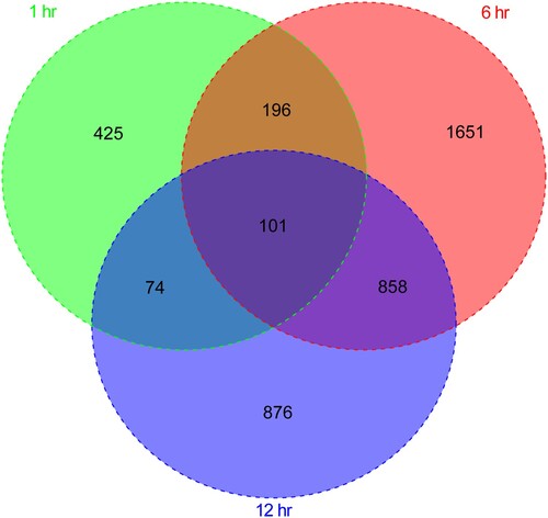
Figure 3. Biological processes and Kyoto Encyclopedia of Genes and Genomes (KEGG) pathway enrichment of DEGs at 1 h (A), 6 h (B), and 12 h (C) after Brucella abortus infection. The horizontal axis represents the number of genes; the vertical axis represents the name of the item; the size of the dot represents the number of genes; the color of the dot represents -log10 (false discovery rate). The dot with a larger size and closer to the red color suggests a greater significance of function enrichment.
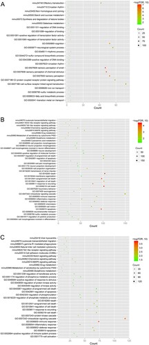
Figure 4. (A) Clustering of samples and determination of soft-thresholding power. Left: Adjacency matrix weight parameter power selection graph. The horizontal axis represents the weight parameter power, and the vertical axis represents the squares of the log(k) and log(p(k)) correlation coefficients in the corresponding network. The red line indicates the standard line, where the square of the correlation coefficient reaches 0.8. Right: Schematic diagram of the average connectivity of RNA under different power parameters. The red line indicates the value of the average connectivity of the network nodes under the value of the power parameter of the adjacency matrix (McDermott et al. Citation2013). In all, 22 was the most fit power value; (B) Tree diagram of module partitioning, and each color represents a different module. Branches of the cluster dendrogram of the most connected genes gave rise to 11 gene co-expression modules. Genes that could not be clustered into one of these modules were assigned to the gray module. The distance between two genes is shown as the height on the y-axis. (C) Heat map of the correlation between modules and sample characterization. The number above each cell represents the correlation between the module and the sample characterization, and the number below each cell represents the corresponding P-value. Red represents positive correlation, and blue represents negative correlation.
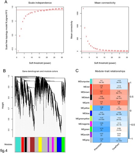
Figure 5. Expression pattern clustering map based on Mfuzz algorithm for differentially expressed genes (DEGs). Mfuzz clustering illustrating the patterns of dynamic changes in the expression of DEGs during the infection time.
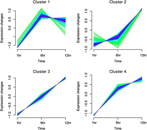
Figure 6. Network of protein-protein interactions. Black, red, green, and blue circles represent genes in cluster 1, cluster 2, cluster 3, and cluster 4, respectively.
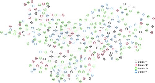
Figure 7. Kyoto Encyclopedia of Genes and Genomes (KEGG) pathways associated with enriched differentially expressed genes. The horizontal axis represents the number of genes; the vertical axis represents the name of the item; the size of the dot indicates the number of genes; and the color of the dot indicates -log10 (false discovery rate). The dot with a larger size and closer to the red color suggests a greater significance of function enrichment.
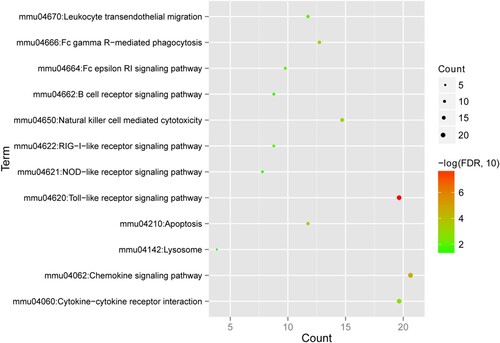
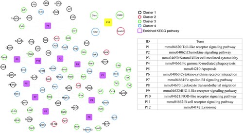
Figure 8. Kyoto Encyclopedia of Genes and Genomes (KEGG) pathway network of Brucella abortus infection. Black, red, green, and blue circles represent genes in cluster 1, cluster 2, cluster 3, and cluster 4, respectively. Purple squares represent significantly enriched KEGG pathways, and yellow squares are directly related KEGG pathways after B. abortus infection.
Data availability statement
The data that support the findings of this study are available in NCBI Gene Expression Omnibus at https://www.ncbi.nlm.nih.gov/, reference number GSE125765.