
Figures & data
Figure 1. Study flow chart.
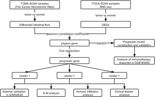
Figure 2. Box plot indicating the relative abundance of differential intestinal microbiota. A, relative abundance of differential intestinal microbiota between tumor samples and paracancerous samples at the phylum level. B, relative abundance of differential intestinal microbiota between tumor samples and paracancerous samples at the genus level. X- axis and Y-axis represent the different types of intestinal microbiota and expression levels, respectively. Blue and red bars represent the tumor and paracancerous samples, respectively.
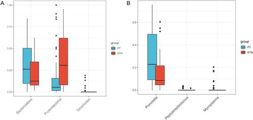
Figure 3. Identification and enrichment analysis of intestinal microbiota-related DEGs: A, interaction network of intestinal microbiota and DEGs. Circles represent DEGs with darker colors indicating more significant P values. The hexagon represents differential intestinal microbiota. The red and blue lines between the two nodes represent positive and negative correlation, respectively. The red node represents up-regulation, while the green node represents down-regulation. B, significantly enriched KEGG pathways. C, assembled GO-BP. Darker colors indicate more significant P values. The larger the node, higher was the number of genes enriched.
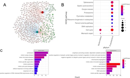
Figure 4. Investigation of the three ESCA subtypes. A, consensus heatmap shows the three ESCA subtypes identified, including clusters 1, 2, and 3. B, PCA plot shows the distribution of samples in three subgroups. C, heat map shows the expressions of these 17 prognostic DEGs in different subgroups and stratified by different clinical information. D, the KM curve shows the difference in survival prognosis between different subtypes. X-axis and Y-axis represents survival time (months) and survival probability, respectively. E, genotyping based on gene clustering was validated in an independent validation dataset (GSE53625). F, survival status was compared between three clusters identified from GSE53625, using a KM curve. G, box plot shows Bacteroidetes distribution in the three subtypes. H, box plot shows Proteobacteria distribution in the three subtypes. I, box plots show the differences in the infiltrations of six immune cells between the three clusters.
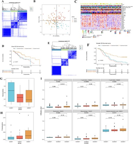
Figure 5. Construction and validation of the prognostic model. A, KM survival curves show the relationships between the expression levels of the 10 gene signatures and survival status of ESCA patients. B and D, distributions of the PS in the TCGA training dataset (B) and GSE53625 validation set (D). C and E, KM survival curves show the survival differences between high-risk and low-risk groups in the TCGA training dataset (C) and GSE53625 validation set (E). F, risk scores of samples in the immunotherapy dataset (GSE165252) were calculated and compared between non-responder and responder ESCA patients.
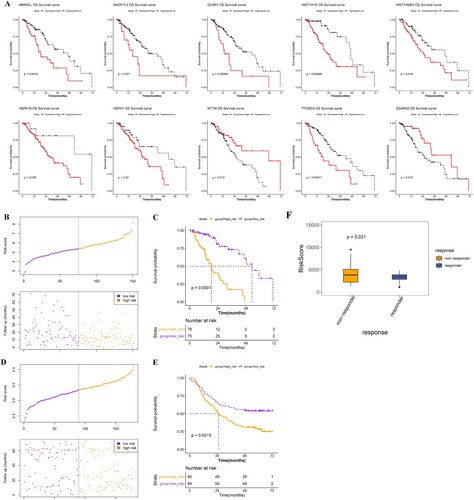
Figure 6. Correlation between gene signatures and the three clusters. A, heatmap shows the expression of the 10 gene signatures in the high- and low-risk groups. B, bar chart shows the distribution of samples of the three subtypes in high- and low-risk groups. C, Sankey diagram shows the relationships between microbiota, gene signature, and their prognostic effects.
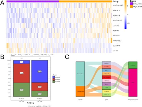
Table 1. Information of the 10-gene-signature.
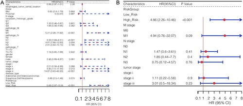
Figure 7. Analysis of independent prognostic factors. Univariate (A) and multivariate (B) Cox regression analyses were used to identify independent prognostic factors according to different clinical characteristics.
Supplemental Material
Download TIFF Image (476.4 KB)Data availability statement
The data that support the findings of this study are available in UCSC Xene (http://xena.ucsc.edu/), TCMA (https://tcma.pratt.duke.edu/), and NCBI-GEO (https://www.ncbi.nlm.nih.gov/geo/).