
Figures & data
Figure 1. A schematic of promoter architecture in S. cerevisiae: The text in crimson (top) denotes the conditions necessary for high sensitivity, while the green text (bottom) denotes the conditions for lower sensitivity. The length of the different regions of the promoter are also given in bp. The jagged line at the bottom denotes the part of the promoter that is rigid in nature.
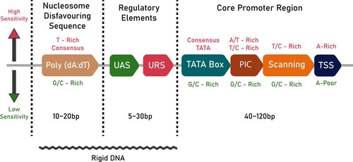
Figure 2. Motif of −49–10 region: Motif logo generated from all 5117 S. cerevisiae promoters from Eukaryotic Promoter Database. The motif is generated for −49–10 sequence with respect to the Transcription Start Site.
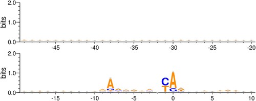
Figure 3. Various fit statistics for the linear regression of segment scores against the mRuby2 fluorescence: One of the ends of the promoter is fixed at −49 and nucleotides are added on the other end towards the TSS. The values of R-squared, Adj. R-squared, and p-value for F-statistic are tabulated in Table S1. Similar plots for Venus and mTurquoise2 fluorescence are given in Fig S2.
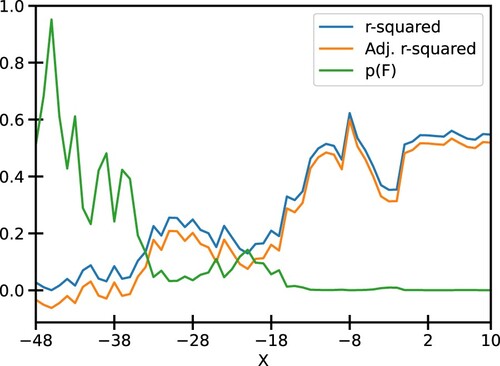
Figure 4. Best fit model for −49–10 segment: (A) Plot of normalized −49–10 score and normalized mRuby2 fluorescence along with the best fit model. (B) Residues obtained from the best fit model. (C) Quantile-Quantile plot of residues against normally distributed theoretical quantiles.
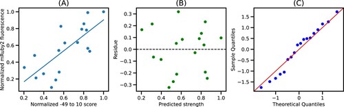
Figure 5. Best fit model for −9–1 segment: (A) Plot of normalized −9–1 score and normalized mRuby2 fluorescence along with the best fit model. (B) Residues obtained from the best fit model. (C) Quantile-Quantile plot of residues against normally distributed quantiles.
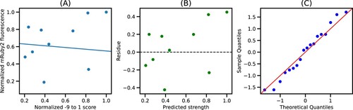
Figure 6. Best fit values of model parameters: The best fit values of C0 and C1 obtained using different fluorescence data as a proxy for promoter strength. The black dot shows the mean value of C0 and C1 weighted by error bars. The data corresponding to this plot can be found in Table S2.
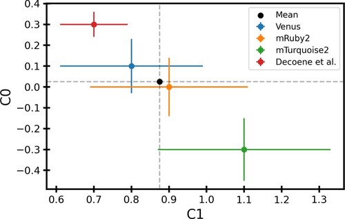
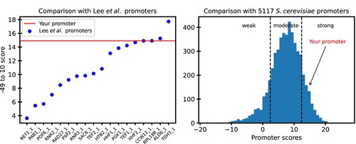
Figure 7. A sample output from QPromoters application: (A) −49–10 score of the user's promoter is shown as a horizontal line on a plot of scores of the characterized promoters from Lee et al. (Citation2015) (B) Arrow shows the score of the user's promoter in reference to scores of all 5117 S. cerevisiae promoters in EPD.
Supplemental Material
Download Zip (2.8 MB)Data availability
The fluorescence data used in this work are openly available in the following publications: Lee et al. (Citation2015) and Decoene et al. (Citation2019) that issue datasets with DOIs. The standalone tool for predicting the promoter strength is open-source and available at https://github.com/DevangLiya/QPromoters. The online version of this tool can be accessed at https://qpromoters.com/.