Figures & data
Fig. 1 Boxplots of the original creative writing scores by treatment group. The dot represents the mean of each group.
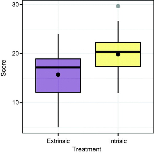
Fig. 2 A lineup consisting of 19 null plots generated via permutation resampling and the original data plot for the creative writing study. The data plot was randomly placed in Panel #10. Can you discern the difference?
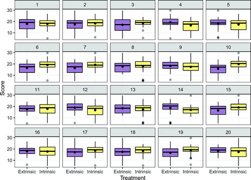
Fig. 3 A lineup of residual plots. The null plots are generated via a parametric bootstrap from the fitted model. The observed data are shown in Panel #9. Can you discern the difference?
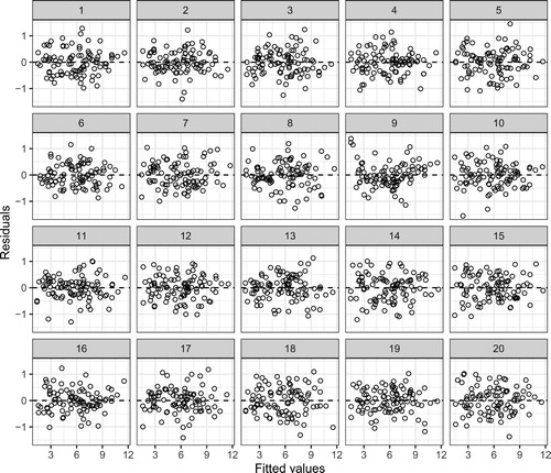
Fig. 4 A lineup for a deficient logistic regression model. The data plot is simulated from a model with a quadratic effect, while the null plots are simulated from a model with only a linear effect. The observed residuals are shown in Panel #8 and are indiscernible from the field of null plots, showing the problematic nature of residual plots for logistic regression.
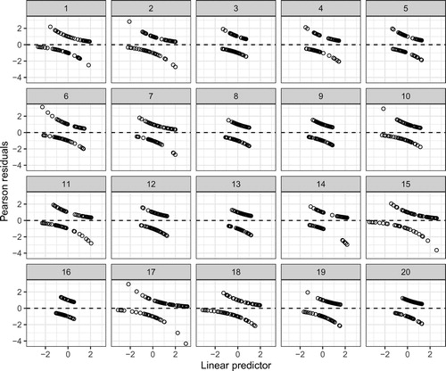
Fig. 5 A binned residual plot from a binary logistic regression model. The average deviance residual is plotted on the -axis for each of 31 bins on the
-axis.
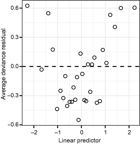
Fig. 6 A lineup of binned residual plots from a binary logistic regression model. The observed residuals are shown in Panel #3 and clearly stand out from the field of null plots, indicating a problem with linearity.
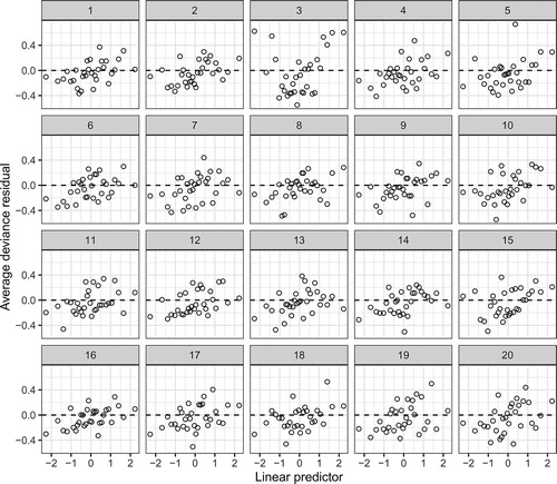
Fig. 7 Two empirical logit plots rendered for the same dataset with n = 55 observations. Panel (a) is rendered using 5 groups while Panel (b) is rendered using 11 groups. The appearance of the plots changes substantially, often leading to confusion in intrepretation.
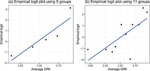
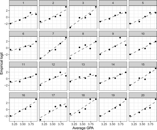
Fig. 8 A lineup of empirical logit plots from a simple binary logistic regression model. The observed plot is shown in Panel #2 and does not stand out from the field of null plots, indicating no problem with linearity.