Figures & data
Table 1 Schramm et al.’s (Citation2018) guidelines can serve as a rubric for assessment of a social justice data table or visualization.
Table 2 Hardship Index data for 7 of the 77 Chicago community areas.
Table 3 Basic knowledge of the history of injustices in urban centers like Chicago should accompany data analysis of current hardship.
Fig. 1 Public domain redlining map from the late 1930s. Green=“Best,” Blue=“Still Desirable,” Yellow=“Definitely Declining,” Red=“Hazardous” (Nelson Citationn.d.).
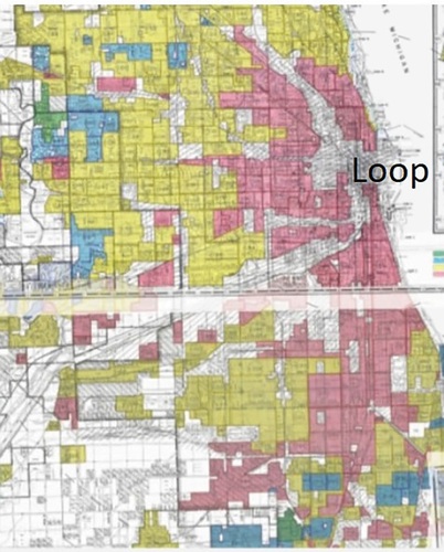
Fig. 2 A data visualization can effectively communicate the history of injustices in a Chicago community area such as Austin.
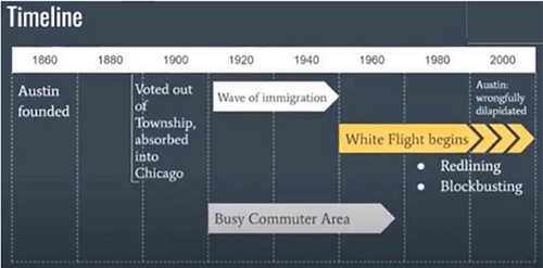
Fig. 3 2013-2017 hardship index data visualization for 3 of 77 Chicago community areas (Data source: Great Cities Institute (Citation2019)).
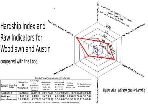
Fig. 4 Geographic plot of Chicago’s 77 community areas with marker color (blue or red) indicating k-means bi-clustering based only on the 6 standardized economic hardship indicators. Affluent community areas such as the Loop (central business district), Near North Side (which includes the “Gold Coast”), and Hyde Park (site of the University of Chicago) appear in blue. Lower-income communities with a history of injustices, including Woodlawn, Englewood, and Austin, appear in red. Marker sizes are proportional to homicide counts, with actual numbers in parentheses following named community areas.
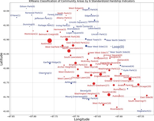
Fig. 5 This visualization is more accessible and transparent than . Marker size and labeled values indicate the 2017 homicide count. Homicide-free communities are indicated in blue. The 2013-2017 hardship index is listed next to the name of each community area.
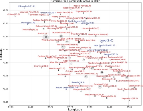
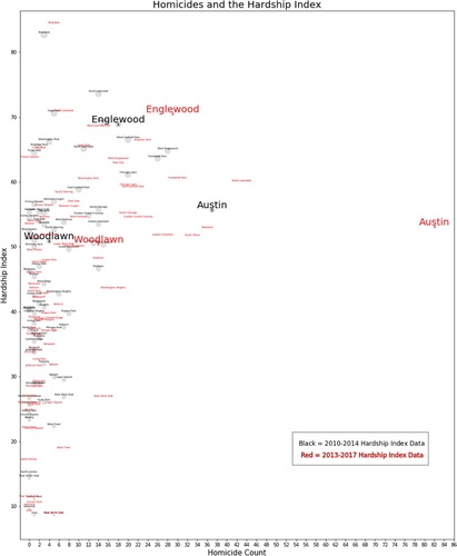
Fig. 6 Homicide count vs. Hardship index.