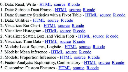
Figures & data
Fig. 1 The pivot() function call to generate a data frame of aggregated data.
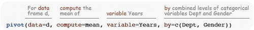
Fig. 2 Default (left) and 100% stacked (right) bar charts.
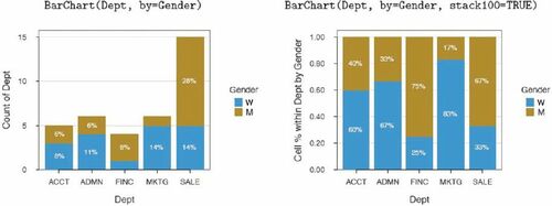
Fig. 3 Default histogram (left) and with a superimposed density plot (right).
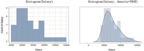
Fig. 4 Scatterplots of two continuous variables, with the least-squares line and 95% confidence intervals (left) and a more enhanced version (right).
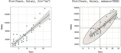
Fig. 5 Trellis boxplots (left) and superimposed Trellis violin, box, and scatterplots (right).
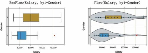
Fig. 6 Data visualization and text output for t-test of the mean difference.
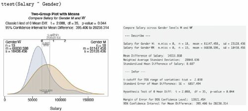
Fig. 7 Data visualizations for t-test of paired differences, dependent groups.
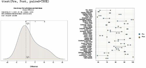
Fig. 8 A scatterplot of factor and response variable from the one-way ANOVA (left) and interaction plot of two factors from the two-way ANOVA (right).
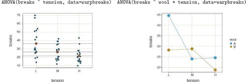
Fig. 9 Default scatterplot matrix (left) and density plots of the distribution of residuals (right) from a regression analysis.
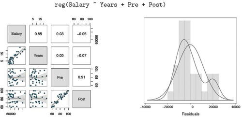
Fig. 10 Fit the same data with residuals about the least-squares line (left) and the null-model line (right) in the respective scatterplots.
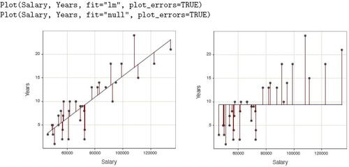
Fig. 11 Scatterplots of two continuous variables at two levels of a third, categorical variable, on the same panel (left) and a Trellis plot (right).
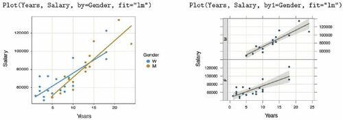
Fig. 12 Interactive Shiny histogram with Histogram() parameter values.
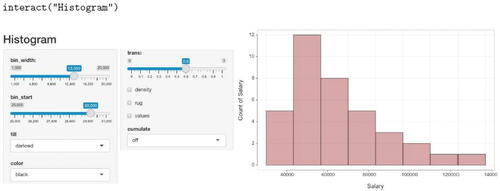
Table 1 lessR simulation functions to facilitate teaching statistical concepts.
Fig. 13 Fifty confidence intervals of the mean across repeated simulated samples.
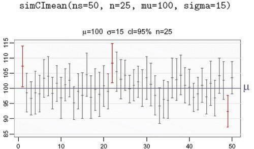
Table 2 lessR probability functions that generate a customized, corresponding visualization in lieu of standard probability tables.
Fig. 14 Normal curve probability for the standardized normal (left) and for a normal distribution with a mean of 50 and standard deviation of 10 (right).
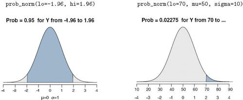
Fig. 15 For the” orange” color theme with a” black” sub_theme, the default bar chart (left) and a time series Trellis visualization (right).
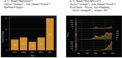
Fig. 16 lessR vignettes.