Figures & data
Table 1 Data dictionary describing the variables displayed throughout the Playmeans app (acquired from Spotify public API).
Fig. 1 Setting up the Spotify “Dev” account.
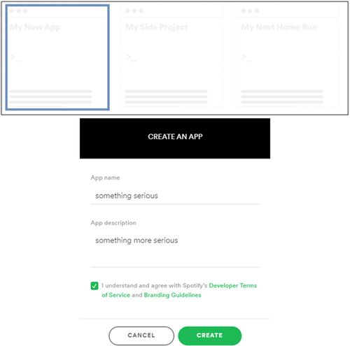
Fig. 2 Obtaining Client ID and Client Secret upon creating the Spotify “Dev” account. The ID and secret in this image are arbitrary and are for illustrative purposes only.
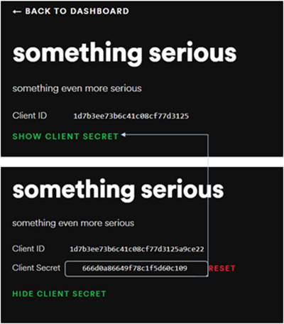
Fig. 3 Logging in to Playmeans.
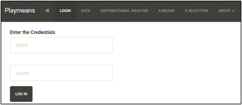
Fig. 4 Searching for an artist.
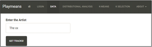
Fig. 5 Data loaded after being pulled from Spotify data repositories in real time. Hovering over the column names displays their definitions.
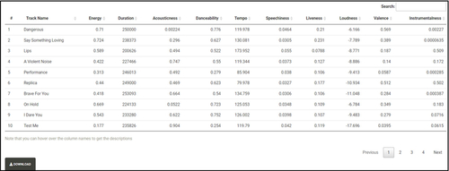
Fig. 6 Histograms of the various data fields are displayed upon selecting the radio buttons in the left panel. Hovering the mouse over each histogram and clicking anywhere within the vertical bars plays a free, 30-second preview of the track falling into the corresponding bin (unless a preview is unavailable from Spotify).
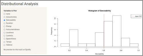
Fig. 7 Interactive profile plot (a) with audio and Static Profile plot (b) without audio. The value of “k” is set using the slider within the tab. In both plots the horizontal axis corresponds to the variables that were used in clustering, and the vertical axis designates the cluster number. In plot (a) the sizes of “emojis” and in (b) the colors are based on the magnitudes of the centroids. In plot (a) hovering over the plot and clicking plays a free, 30-second preview of a track randomly selected from a cluster that was clicked (if a preview is available from Spotify).
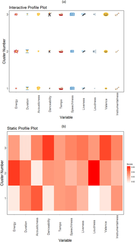
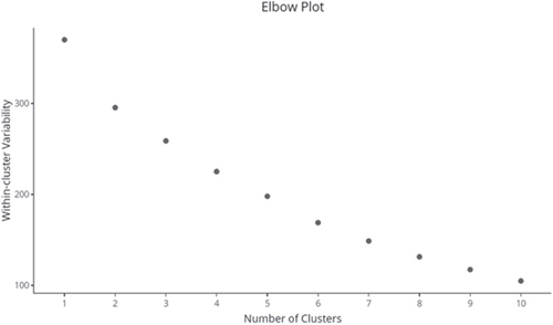
Fig. 8 Elbow plot after performing K-means clustering with values of “k” ranging from 1 to 10. The horizontal and vertical axes correspond to the value of “k” and the within-cluster sums of squares, respectively.