Figures & data
Table 1. The rolling window scheme keeps the size of the data at two years in the full estimation.
Figure 1. Return of HSI. The red dots are the trading days that the return dropped below the three standard deviations from the mean over the whole study period.
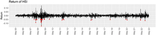
Figure 2. The network densities over time of the three networks constructed using the critical value for a 21-day historical correlation to be significantly positive at the (a) (b)
and (c)
levels.
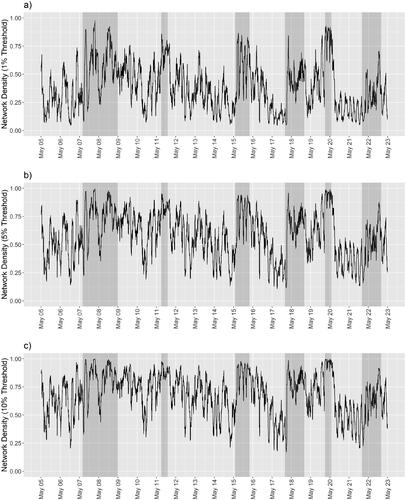
Figure 3. The systemic risk scores in four financial scenarios (Scenario 1: (a–c); Scenario 2: (d–f); Scenario 3: (g–i); Scenario 4: (j-l)) under three different threshold values of correlation in the construction of networks (1% Threshold: (a, d, g, j); 5% Threshold: (b, e, h, k); 10% Threshold: (c, f, i, l)). The red lines refer to the baseline systemic risk scores. The lines in other colors refer to the measurements of systemic risk under specific considerations.
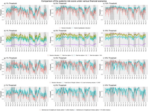
Table 2. The four financial scenarios that make use of the specifications of hyperparameters and distributions of choice are listed in Section 2.2.
Figure 4. We compare by dynamic time wrapping the performance of the Das (Citation2016) and our proposed systemic risk scores (red): using the financial space model (a–c), using the adjacency matrix directly (d–f), and using a random effects model (g–i), with the returns of the HSI (blue) as the reference. We construct the network using the critical value for 21-day of historical correlation to be significantly positive at the (a, d, g) (b, e, h)
and (c, f, i)
levels. We only present those dotted lines that are relevant to financial turbulence, to indicate the lead and lag relationships during the turbulence.
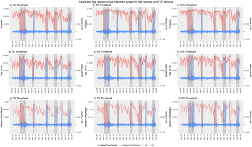
Figure 5. The complete wrapping curves between the Das (Citation2016) and our proposed systemic risk scores (red): using the financial space model (a-c), using the adjacency matrix directly (d-f), and using a random effects model (g-i), with the returns of the HSI (blue) as the reference. We construct the network using the critical value for 21-day of historical correlation to be significantly positive at the (a, d, g),
(b, e, h), and
levels (c, f, i).
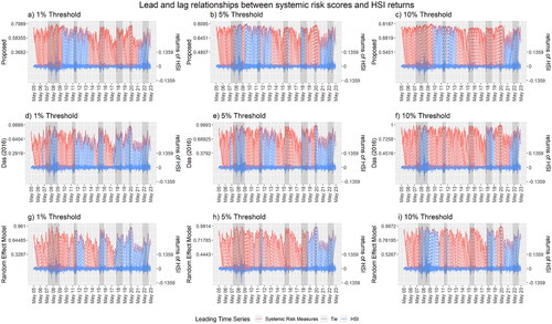
Table 3. Number of time points in the wrapping curve that each systemic risk score leads, ties with, or lags the returns of the HSI, as summarized from .
Figure 6. We compare here by dynamic time wrapping the performances of three other systemic risk measures: (a) CoVaR, (b) the systemic expected shortfall, and (c) the absorption ratio, using the returns of the HSI as the reference time series. We include only the dotted lines for the time points that are relevant to financial turbulence.
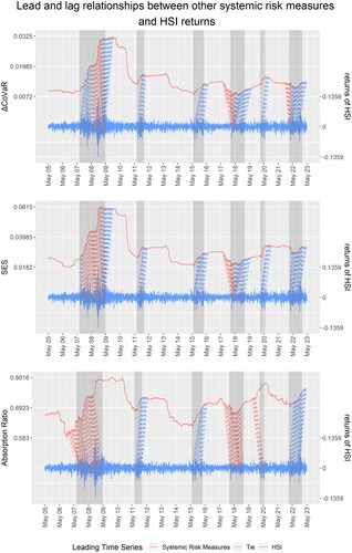
Figure D1. The posterior plot of each rolling sample (arranged in colors) for all three thresholds (1% Threshold: (a-b); 5% Threshold: (c-d); 10% Threshold: (e-f)) along the iterations using (a, c, e) and
(b, d, f) particles.
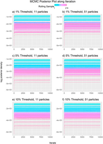
Figure D2. The trace plot of effect parameters in each rolling sample (arranged in colors) for all three thresholds (1% Threshold: (a, d, g, j); 5% Threshold: (b, e, h, k); 10% Threshold: (c, f, i, l)) along the iterations when using particles.
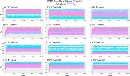
Figure D3. The trace plot of effect parameters in each rolling sample (arranged in colors) for all three thresholds (1% Threshold: (a, d, g, j); 5% Threshold: (b, e, h, k); 10% Threshold: (c, f, i, l)) along the iterations when using particles.
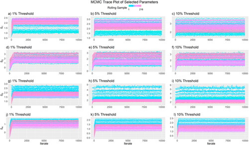
Figure D4. The update rate of the particles Gibbs approach with (solid) and
particles (dashed) to the parameter
on some selected rolling sample (4: (a); 118: (b);216: (c)). The black lines indicate the ideal rates of
(
solid;
dashed) Lindsten et al. (Citation2014).
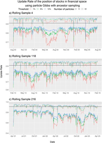
Figure D5. The area under ROC over each rolling sample (date referred to the last trading day in each rolling sample) and each of the network (red),
(green), and
(blue) respectively using
(solid) and
(dashed) particles.
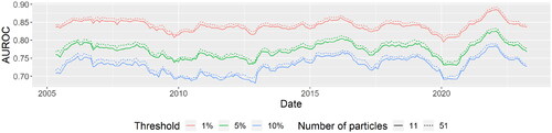
Table D1. The average finalized step size of each parameter and of each systemic risk score when using and
particles.
Table D2. The minimum, mean, and maximum of the average acceptance rates over all parameters during each MCMC stage and of each systemic risk score when using particles.
Table D3. The minimum, mean, and maximum of the average acceptance rates over all parameters during each MCMC stage and of each systemic risk score when using particles.
Table D4. The minimum, mean, and maximum of the average effective sample size over parameters during each MCMC stage and of each systemic risk score when using particles.
Table D5. The minimum, mean, and maximum of the average effective sample size over parameters during each MCMC stage and of each systemic risk score when using particles.
Table D6. The number of stocks, the number of trading days, and the computation time taken for the MCMC of three selected rolling samples.
Figure E1. The MCMC trace plot (a, b, d, e, g, h) and the density plot (c, f, i) of CNOOC Limited (0883.HK) (a-c), BOC Hong Kong (2388.HK) (d-f), and Esprit Holdings (0330.HK) (g-i) on 8 April 2005 in the first rolling sample. The red cross indicates the estimated posterior mean.
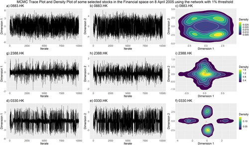
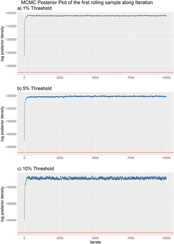
Figure E2. The log posterior density of the first rolling sample based on the network constructed by the three threshold levels (1% Threshold: (a); 5% Threshold: (b); 10% Threshold: (c)). The red horizontal line indicates the log posterior density evaluated at the posterior mean.