Figures & data
Table 1 Module Assessment schedule before (2002–07) and after (2008–09) changes.
Figure 1 Scatter plot of % scored in one item of assessment (in this case the Blackboard on-line test worth 15% of the module weighting) vs. overall module total (%).
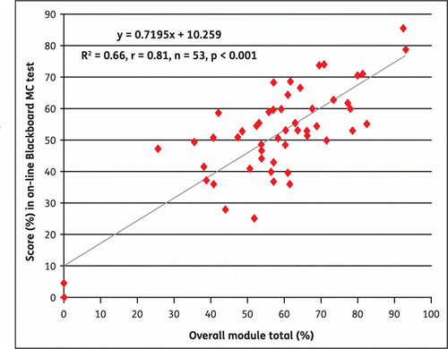
Figure 2 Scatter plot showing class mean for weighted assessment items vs.unweighted assessment items.
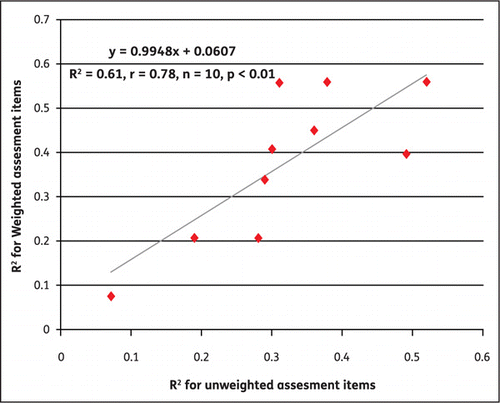
Table 2 Pearson correlation coefficients for individual assessments items vs. module total (2003–09).
Table 3 Ranking of students’ performance in different assessment items, and calculation of the difference between each assessment item and their overall module total ranking.
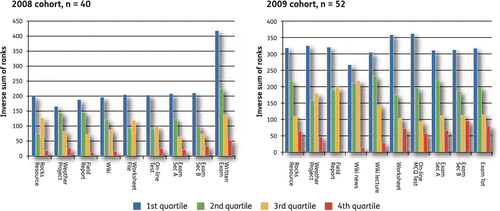
Figure 3 Rankings in different assessment items analysed by student quartiles for 2008 and 2009 module cohorts.