Figures & data
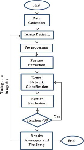
1 Step by step flow chart of implemented system
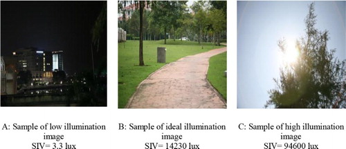
2 Sample of input images with their corresponding SIV value
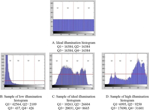
3 Sample of image histograms (256 × 256) with their corresponding quarter's value. Vertical lines separating quarters from each other and horizontal line refer to ideal histogram level. Horizontal axis represents CIE XYZ y component value; vertical axis represents number of pixels in each Y component value
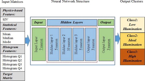
4 Designed neural network structure: eight inputs correspond to eight features (mean, mode, median, SIV and Q1 to Q4), and three outputs correspond to three output clusters (low, ideal and high illumination)
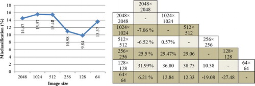
5 Misclassification rate analysis. On left, chart shows misclassification rate changes by changing image resolution. On right, separated improvement of each image resolution is compared to others by percentages. Negative values in table show that instead of reduction increase occurred
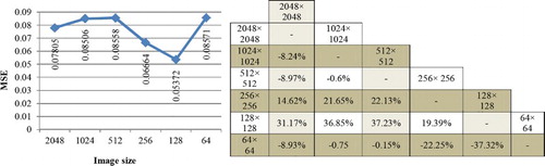
6 Mean square error analysis. On left, chart shows MSE changes by changing image resolution. On right, separated improvement of each image resolution is compared to others by percentages in terms of MSE
7 R square analysis. On left, chart shows R square changes by changing image resolution. On right, separated improvement of each image resolution is compared to others by percentages in terms of R square
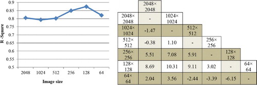
Table 1 Feature values for three different images from various illumination classes presented by various image resolutions
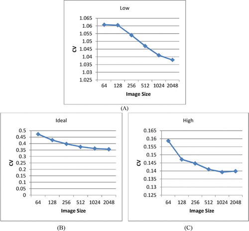
8 Coefficient of variation of histogram quarter features separated by image illumination class: (A) low illumination class, (B) ideal illumination class and (C) high illumination class