Figures & data
FIGURE 1 Regional map showing the location of Upper and Lower Murray Lakes as well as other sites mentioned in the text. Also shown is the grid box associated with NCEP/NCAR reanalysis temperature data used in this study.
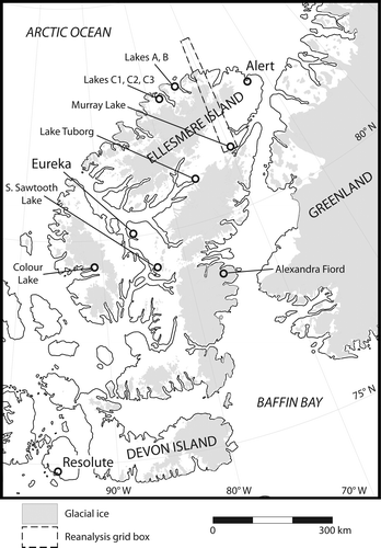
FIGURE 2 Aerial photograph looking north across Lower Murray Lake in the foreground and Upper Murray Lake which wraps behind the hill to the left in the background. Note the significant shadow across much of Lower Murray Lake which occurs in the afternoon.
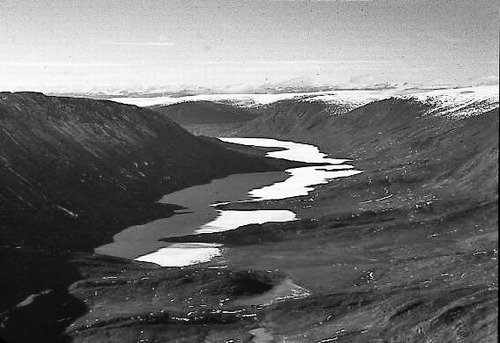
FIGURE 3 Sequence of RADARSAT-1 SAR image sub-scenes showing an increase in the percentage of open water (dark, textureless tone) on Upper and Lower Murray Lakes during the year 2000 melt season. The original RADARSAT-1 data (©Canadian Space Agency—CSA) were provided by the Alaska Satellite Facility (ASF).
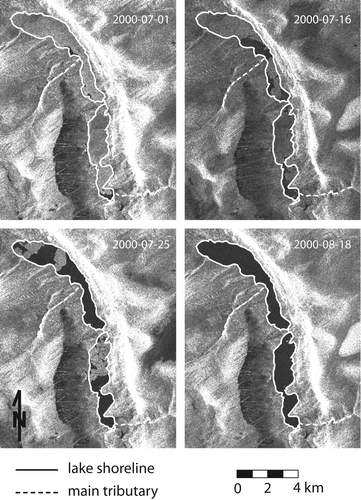
FIGURE 4 Comparison of RADARSAT-1 SAR image sub-scenes (left) with Landsat ETM+ imagery (right). The similar pattern of open water and ice observed in the two data sets helps to validate the interpretation of the SAR imagery in terms of ice extent. The black lines in the 25 July 2003 Landsat image are a consequence of the failure of the Scan Line Corrector onboard Landsat 7 on 31 May 2003. Note that the SAR data has not been terrain corrected, thus the location of high relief features on the landscape may appear out of place. The original RADARSAT-1 data (©Canadian Space Agency—CSA) were provided by the Alaska Satellite Facility (ASF); Landsat images were provided by the U.S. Geological Survey.
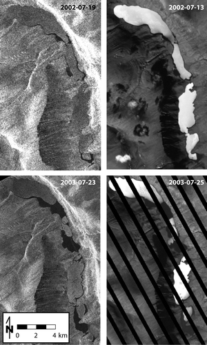
FIGURE 5 (left) Mean daily temperature at the Murray Lakes compared to reanalysis temperature data from a grid box centered on 82.5°N, 70°W. The reanalysis data (dashed gray line) systematically underestimated May–September temperatures at the Murray Lakes. Consequently, the reanalysis temperature record was adjusted based on a linear regression of the May through September temperature data (right). The adjusted reanalysis temperature series (thin black line) shows much better agreement with the local observations (solid gray line).
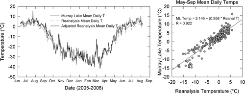
Table 1 Results of correlation analysis between the mean daily temperature record at the Murray Lakes and the available long-term regional records.
FIGURE 6 Annual record of ice decay on Upper and Lower Murray Lakes showing changes in the area of the lake covered by ice during each summer from 1997 through 2007.
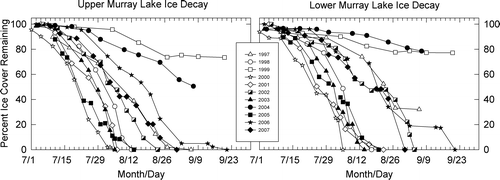
Table 2 Pearson product moment correlation results between the timing of ice-out on Upper (UML) and Lower (LML) Murray Lakes mean temperatures over various time intervals. Significant correlations are in bold. *The term “melt period” is defined herein as the interval between the first day of above-freezing temperatures and the ice-out date.
FIGURE 7 Mean June and July temperatures anomalies (relative to 1997–2007 mean) and ice-out dates for the each year of the record. Note that the ice-out date scale has been reversed in order to emphasis the relationship between summer temperatures and the timing of ice-out. Missing data points reflect those years in which complete ice-out did not occur.
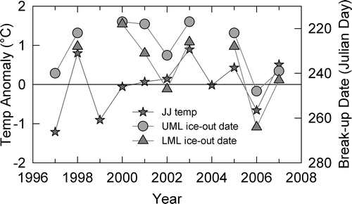
FIGURE 8 RADARSAT-1 SAR image sub-scenes showing initial ice breakup on Upper and Lower Murray Lakes. Note the consistent pattern of open water first occurring near the center of Upper Murray Lake and the south end of Lower Murray Lake. The original RADARSAT-1 data (©Canadian Space Agency—CSA) were provided by the Alaska Satellite Facility (ASF).
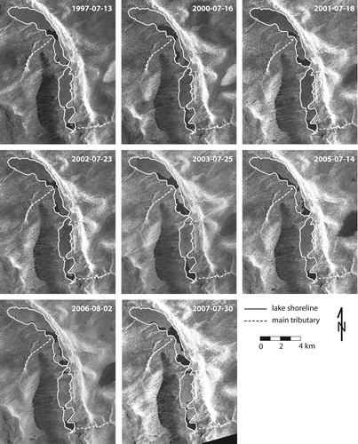
FIGURE 9 Seasonal variations in the angle of the sun above the horizon for different times of day at the Murray Lakes field site.
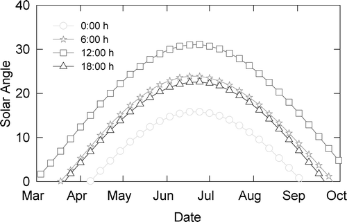
FIGURE 10 (top) Percent ice cover remaining on Upper and Lower Murray Lakes plotted as a function of cumulative melting degree days (CMDD). Plots include all data from 1997 to 2007, with each data point reflecting the percentage of ice cover remaining and the total CMDD on the date the SAR image was acquired. (bottom) Cumulative melting degree days calculated based on mean daily temperatures during 1997–2007 and 0.5, 1.0, and 1.5 °C reductions from this mean. Comparison of the top and bottom panels indicate that complete melting of Upper and Lower Murray Lakes is unlikely to occur if temperatures are reduced by 1.0 °C, resulting in an end of melt-season total of only ∼250 CMDD.
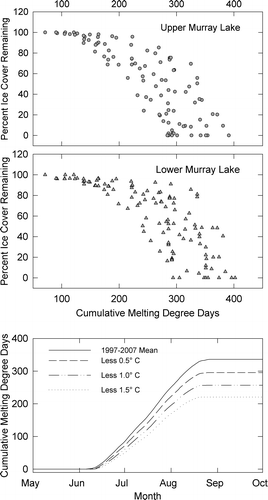
Table 3 Ice-out dates and the total cumulative melting degree days (CMDD) required to reach ice-out on Upper and Lower Murray Lakes during each year of the record. Missing values indicate complete ice-out did not occur.
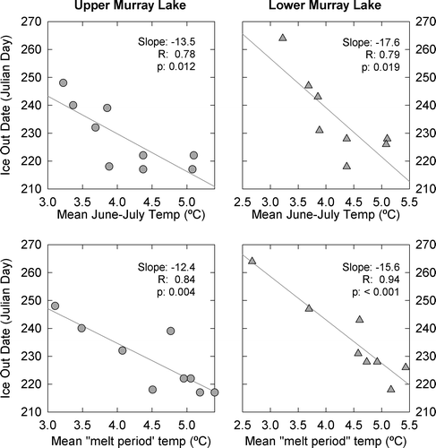
FIGURE 11 The relationship between the timing of ice-out and mean June and July (top) and “melt period” (bottom) surface air temperatures. Linear regression lines indicated that ice-out on the Murray Lakes is likely to occur ∼12 to 18 days earlier per °C temperature increase. Years during which complete ice-out did not occur are not plotted.