Figures & data
Table 1 Baseline Characteristics of the GNPNAT1 High Expression Set and the Low Expression Set in the TCGA Cohort
Table 2 Baseline Characteristics of the GNPNAT1 High Expression Set and the Low Expression Set in the Validated Cohort
Figure 1 The expression level of GNPNAT1 in breast cancer. (A) The GNPNAT1 expression level of different cancers in the TCGA dataset. (B) GNPNAT1 expression of different breast cancer subtypes in TCGA+GTEx dataset. (C) GNPNAT1 expression in breast cancer invalidated cohort. *P<0.05, **p<0.01, ***p<0.001.
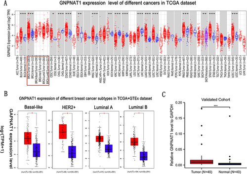
Table 3 The Correlation Between GNPNAT1 Expression and Clinicopathologic Factors in the TCGA Cohort
Figure 2 (A–H) GNPNAT1 expression level in Race, Menopause status, Pathological stage, N stage, Histological type, ER status, PR status, and HER2 status based on different clinical features. *P<0.05, **p<0.01, ***p<0.001.
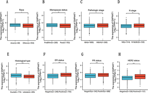
Figure 3 Diagnostic value of the expression of GNPNAT1 and the correlation between SND1 gene expression and the survival prognosis of cancers in TCGA. (A) The expression level of GNPNAT1 in different breast cell lines. (B) ROC curve for differentiating normal people and breast cancer patients. (C and D) The survival map (C) and survival curves (D) of GNPNAT1 in breast cancer from the GEPIA2 dataset. *P<0.05, **p<0.01.
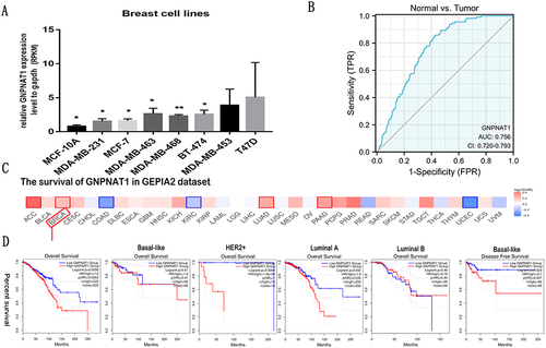
Table 4 Univariate COX Regression Analysis for Overall Survival in the TCGA Cohort
Table 5 Univariate COX Regression Analysis for Disease Free Survival in the TCGA Cohort
Table 6 Multivariate COX Regression Analysis for Overall Survival in the TCGA Cohort
Figure 4 A nomogram for predicting the 1-year, 3-year, and five-year survival probability of breast cancer patients.
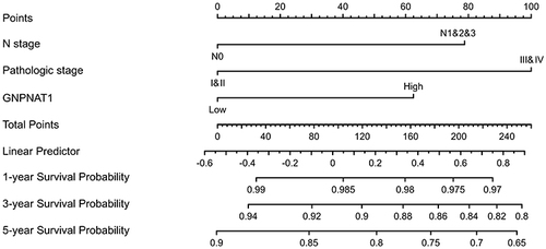
Table 7 Connection Between the Expression Level of GNPNAT1 and the Immune Infiltration in the Tumor Microenvironment
Figure 5 Correlations between the expression of GNPNAT1 expression and immune infiltration. (A) The bar graph is about the immune infiltration level of different immune infiltration cells. (B) The lollipop figure is about the immune infiltration level of different immune infiltration cells. (C) The scatter diagrams about the immune infiltration level of different immune infiltration cells. (D) The heatmap about the correlation between different immune infiltration cells and breast cancer. *P<0.05, **p<0.01, ***p<0.001.
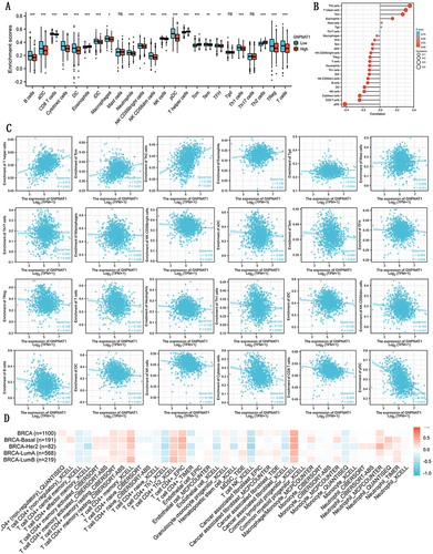
Figure 6 Mutation feature of GNPNAT1 in TCGA. (A) The alteration frequency GNPNAT1 with mutation type in different cancers. (B) The alteration frequency with mutation site in breast cancer. (C) The 3D structure of GNPNAT1 in breast cancers. (D) The alteration frequency GNPNAT1 with mutation type in whole cancers.
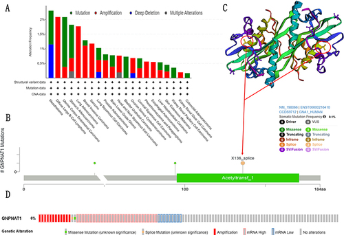
Table 8 The Basic Information of IHC Slice
Figure 7 GNPNAT1-related gene enrichment analysis. (A) (B) Heat map about the top 5 GNPNAT1-related gene enrichment. (C) The scatter diagrams about the top 5 GNPNAT1-related gene enrichment. ***p<0.001.
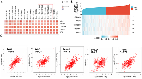
Figure 8 GNPNAT1-binding proteins enrichment analysis. (A) The difference in GNPNAT1 total protein between breast tumor and normal breast tissues. (B) The connection net of the top 50 GNPNAT1-binding proteins. (C) A Venn diagram about intersection analysis of the top 50 proteins and the top 100 genes.
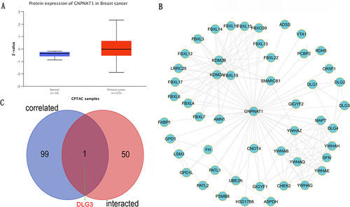
Figure 9 GO and KEGG enrichment analyses of GNPNAT1. (A) GO enrichment analyses of GNPNAT1. (B) GO enrichment interactive network colored by cluster-ID (C) and P-value. (D) KEGG enrichment analyses of GNPNAT1.
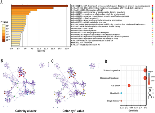
Figure 10 Protein–protein interaction network and IHC slices of GNPNAT1. (A) Protein-protein interaction network of GNPNAT1. (B) IHC slices of GNPNAT1.
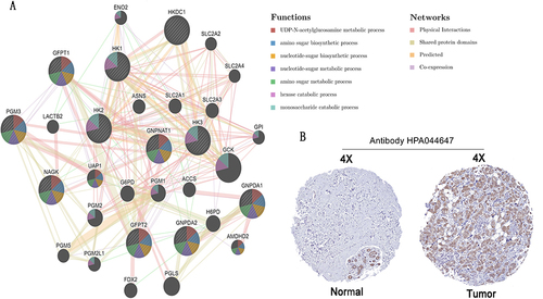
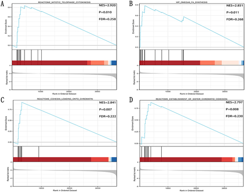
Figure 11 (A) Reactome mitotic telophase cytokinesis, (B) WP OMEGA9 FA synthesis, (C) Reactome cohesion loading chromatin, and (D) Reactome establishment of sister chromatid cohesion were the top four signaling pathways of GNPNAT1-related.