Figures & data
Figure 1 Representative geographic distribution of Brazilian macroregions and their respective cancer estimates for the year 2014.
Notes: The main population agglomerates are the South and Southern Regions. Data were obtained from the Instituto Nacional de Câncer (INCA) (2014).Citation23
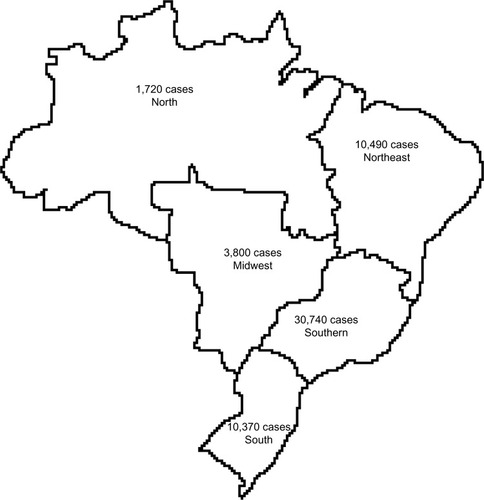
Figure 2 Breast cancer mortality rates in Brazil in the period 1992–2012.
Note: Data were collected from the DATASUS online database (DATASUS, 2011).Citation8
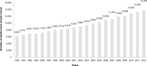
Table 1 Number of deaths associated with breast cancer and specific age groups in the period 1992–2012
Table 2 Distribution according to the BI-RADS of mammograms performed in the period 2009–2013
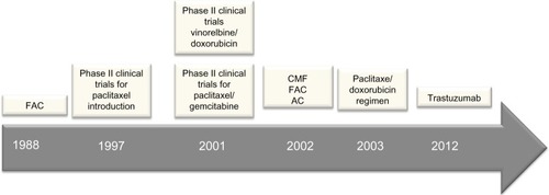
Figure 3 Timeline representing the main treatment options employed under Brazil’s public health system (SUS) for treating breast cancer patients.
Abbreviations: AC, adriamycin, cyclophosphamide; CMF, cyclophosphamide, methotrexate, 5-fluorouracil; FAC, 5-fluorouracil, adriamycin, cyclophosphamide; SUS, Sistema Único de Saúde.