Figures & data
Table 1 Details of the GEO AD Data
Table 2 The Primer Used in RT-qPCR
Table 3 The DEGs of AD
Figure 1 Data after normalization. (A) Standardization of selected samples of GSE63741. (B) Standardization of GSE124700. Green bars represent AD, blue bars represent control.
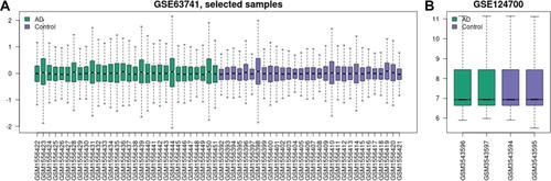
Figure 2 Identification of DEGs in AD. (A) The differentially expressed genes of GSE63741. (B) The differentially expressed genes of GSE124700. (C) 8 DEGs were consistently downregulated in the two datasets. (D) 14 DEGs were consistently upregulated in the two datasets. The green point represents downregulated genes, the red point represents upregulated. |log FC|>1 and p-value <0.05 were set as the difference.
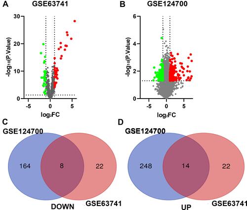
Figure 3 The heat map of the DEGs. The color from green to red indicates the expression of genes from low to high.
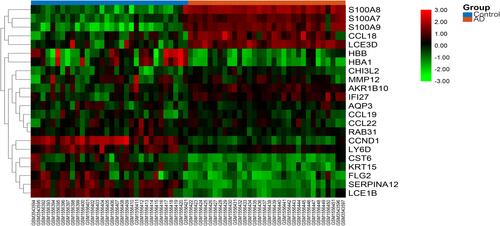
Table 4 The Top 10 Function and Pathway Enrichment Items of the DEGs
Figure 4 The GSEA analysis of the DEGs. (A) Biological processes, cellular components and molecular functions. (B) The signaling pathways.
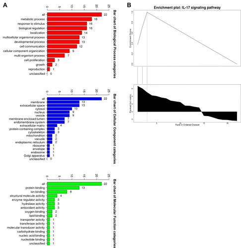
Figure 5 The top 10 items of GO and KEGG enrichment analysis of DEGs. (A) GO Biological processes. (B) GO cellular components. (C) GO molecular functions. (D) KEGG signaling pathways. **p<0.01; ***p<0.001.
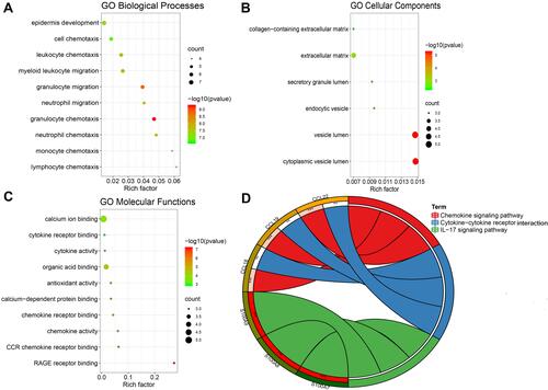
Table 5 The Top 5 Hub Genes
Figure 6 The PPI network analysis and identification of hub genes. (A) PPI network of the DEGs. The sizes of the edges and nodes represent the degree, which is the bigger size representing the higher degree. The green node represents downregulated gene and the red represents upregulated. (B) The first module of the PPI network. The green node represents downregulated gene and the red represents upregulated. (C) 5 hub genes were identified through the cytoHubba plug-in. (D) The biological process of hub genes through ClueGO plug-in. (E) Signaling pathways of hub genes through ClueGO plug-in.
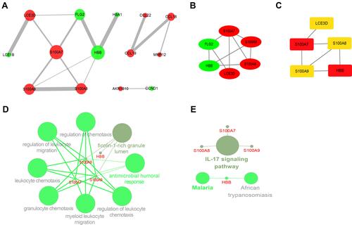
Table 6 Results of AUCs for Hub Genes
Figure 7 Data verification of hub genes through GSE121212. (A) Gene expression of each hub gene. (B) The ROC curve of each hub gene. **p<0.01; ****p<0.0001.
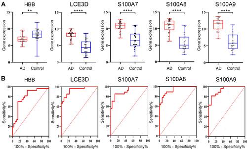
Figure 8 The difference of immune infiltration between AD and controls. (A) PCA performed on all samples. (B) The proportion of immune cells in AD and controls. *p<0.05; **p<0.01; ***p<0.001; ****p<0.0001; blue represents control and red represents AD.
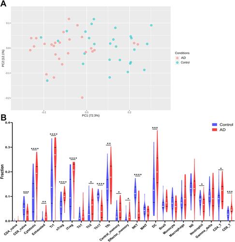
Figure 9 The correlation between hub genes and immune cells. (A) HBB. (B) LCE3D. (C) S100A7. (D) S100A8. (E) S100A9. P< 0.05 was considered as statistical significance.
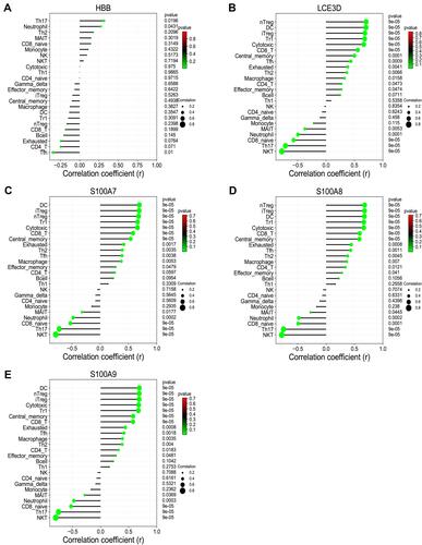
Table 7 The miRNAs Targeting Hub Genes
Table 8 The ceRNA Network of AD
Figure 10 Venn diagram showed the miRNAs targeting each hub gene which were predicted in the online database. (A) HBB. (B) LCE3D. (C) S100A7. (D) S100A9. (E) S100A8. Predicted in ≥3 object databases were considered as true.
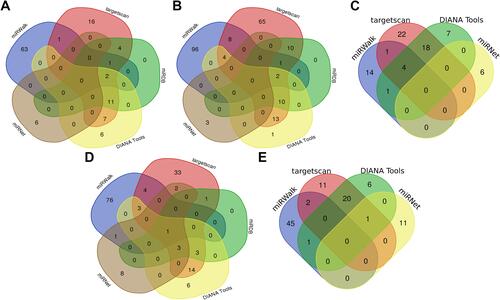
Figure 11 Venn diagram showed the lncRNAs which were predicted to target the identified miRNA in online database. (A) hsa-miR-361-3p. (B) hsa-miR-513a-5p. (C) hsa-miR-1224-5p. (D) hsa-miR-98-5p. (E) hsa-miR-132-5p. (F) hsa-miR-766-5p. (G) hsa-miR-588. Predicted in ≥4 object databases were considered as true.
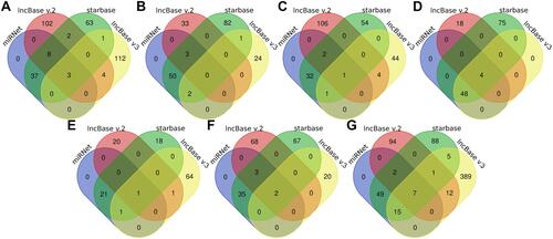
Figure 12 The lncRNA–miRNA–mRNA ceRNA network of AD. (A) The ceRNA network was constructed through Cytoscape software. The triangle represents the hub gene, and the circle represents the miRNA and the rhombus represents the lncRNA. The lncRNA whose degree was highest was painted red. (B) The alluvial diagram of the ceRNA network.
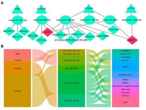
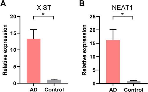
Figure 13 RT-qPCR validation of the core lncRNAs of the ceRNA network. (A) The relative expression of XIST between AD and healthy control. (B) The relative expression of NEAT1 between AD and healthy control. *p<0.05.