Figures & data
Figure 1 DES model for the in-hospital phase (top-left box) and lifetime Markov model (bottom-right box) for SU-AVR vs TAVIs comparison.
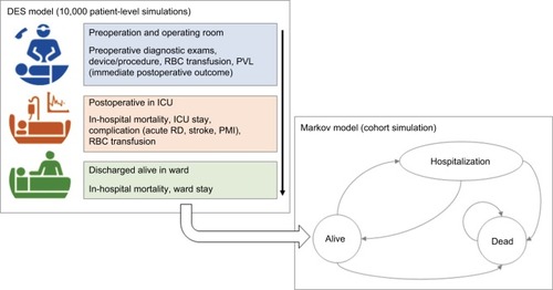
Figure 2 Kaplan–Meier overall survival with and without PVL compared with fitted curves obtained from Weibull regression (dashed lines).
Abbreviation: PVL, paravalvular leak.
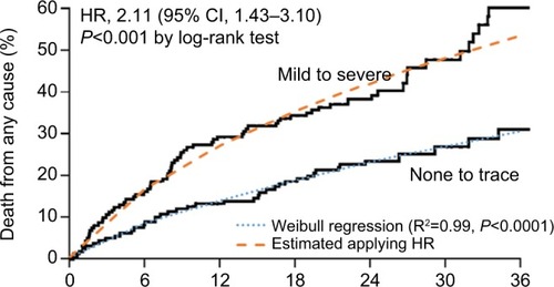
Figure 3 Hospitalization-free survival after hospital discharge for SU-AVR and TAVI patients.
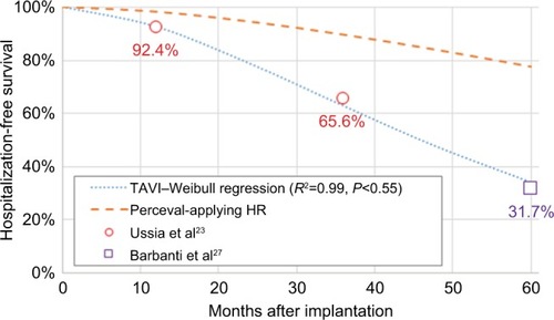
Figure 4 NYHA distribution after discharge and time evolution up to 4 years.
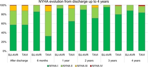
Table 1 List of unit/annual/per episode costs used in the model for each country considered in the analysis
Table 2 Effectiveness results: values expressed as mean and interquartile range
Figure 5 Comparison between incremental cost items for the six analyzed countries.
Abbreviations: SU-AVR, sutureless aortic valve replacement; TAVIs, transcatheter aortic valve implants; w/o, without.
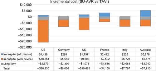
Table 3 Economic results: values expressed as mean and interquartile range
Figure 6 Joint distribution of cost and QALY differences for the six countries considered in the analysis (the result of 1,000 samples); continuous line represents the 95% confidence ellipse.
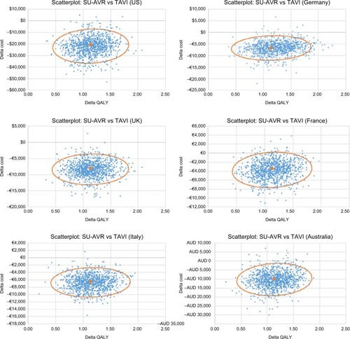
Figure 7 Tornado diagram of QALY gain (SU-AVR vs TAVIs): Blue bars (min) represent QALY gain for the minimum value of each parameter, and orange bars (max) represent QALY gain for the maximum value of each parameter.
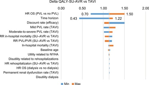
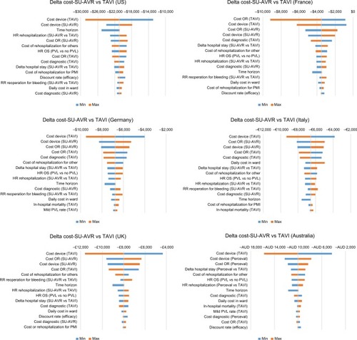
Figure 8 Tornado diagram of cost differences (SU-AVR vs TAVIs) for the six countries considered in the analysis: Blue bars (min) represent cost differences for the minimum value of each parameter and orange bars (max) represent delta cost for the maximum value of each parameter.