Figures & data
Figure 1 Markov model depicts patient’s health and work status at each follow-up period. Each node represents transition to health states associated with different costs and utility scores.
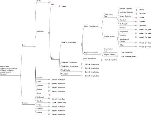
Table 1 Probability of Complications Depending on Preoperative Health Care Status
Table 2 Direct Surgical Costs
Table 3 Base Case Results with Medicare and Private Rates (Both Perspectives)
Table 4 Scenario Sensitivity Analyses: Cost-Effectiveness of P-15 vs Control in Alternative Scenarios
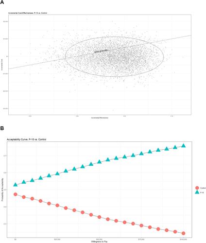
Figure 2 (A) Cost-effectiveness scatter plot representing 5,000 simulated iteration of input parameter variations. The resultant difference in increments of cost vs effectiveness is illustrated. Simulation points below the WTP line indicate cost-effectiveness. (B) Cost-effectiveness acceptability curves created based on the sensitivity analysis scatter plot. Percentages of iterations achieving cost-effectiveness are plotted for either group based on willingness-to-pay thresholds.