Figures & data
Table 1 Model Inputs
Table 2 Model Results: Base Case and Scenario Analyses
Figure 1 Health care costs for the first year of life and preterm birth rates by gestational age, usual care, 2016 data from the HealthCore Integrated Research Database.
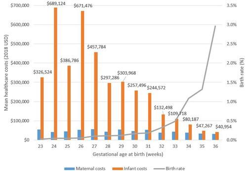
Table 3 Model Results: Base Case Additional Endpoints
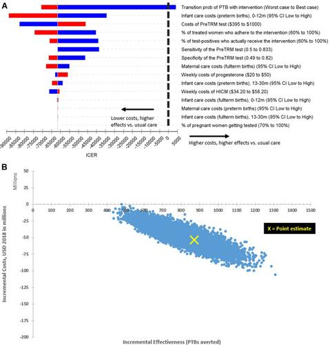
Figure 2 Model results: Sensitivity analyses. (A) Univariate sensitivity analysis (tornado diagram), base case. The tornado diagram (upper panel) ranks input parameters by their influence on the incremental cost-effectiveness ratio (ICER), from highest to lowest. (B) Probabilistic sensitivity analysis, base case. Each blue dot in the ICER scatter plot (lower panel) represents one of the 10,000 PSA simulation outcomes. The scatter plot is wedge-shaped with all mass in the second quadrant. All dots below the x-axis represent cost savings. In the base case, all simulations are associated with cost savings and PTB reductions.