Figures & data
Figure 1 Flowchart of inclusion of citizens in the economic evaluation.
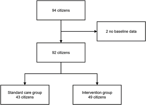
Table 1 Baseline Characteristics of Citizens in Standard Care Group and Intervention Group. Data are Reported as Mean (Standard Deviation) Unless Otherwise Noted
Table 2 Non-Imputed and Unadjusted Values of the Health Outcomes per Citizen in the Intervention Group and Standard Care Group
Table 3 Non-Imputed and Unadjusted Mean Resource Use per Citizen for the Intervention Group and Standard Care Group Over 3 Months Follow-Up and Applied Unit Costs
Table 4 Results of Intervention Group Compared to Control Group
Figure 2 Incremental cost-effectiveness plane with the indication of the base case and sensitivity analyses and scatter plot of the probabilistic sensitivity analysis of the base case. The line across the plot indicates a cost-effectiveness threshold of £20,000 per quality-adjusted life-year (QALY).
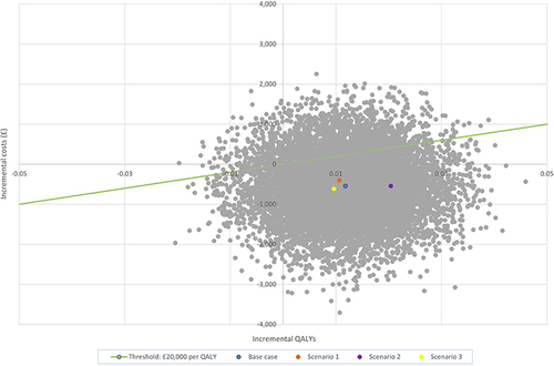
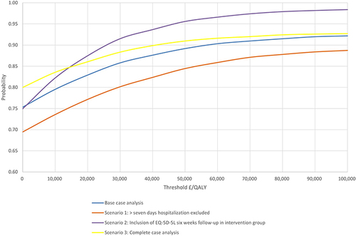
Figure 3 Cost-effectiveness acceptability curve. The probability that the base case and each of the sensitivity analyses are cost-effective at varying willingness-to-pay thresholds. The blue line represents the base case analysis, the Orange scenario 1, the purple scenario 2, and the yellow scenario three, respectively.