Figures & data
Figure 1 Study flow diagram.
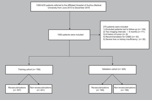
Table 1 Participant Characteristics
Table 2 Univariate Logistic Regression Analysis of Revascularization Based on Preoperative Data in the Training Cohort
Table 3 Multivariate Logistic Regression Analysis of Revascularization Based on Preoperative Data in the Training Cohort
Figure 2 Nomogram used for predicting revascularization after PCI in ACS patients. The final score (ie, total points) is calculated as the sum of the individual scores of each of the ten variables included in the nomogram.
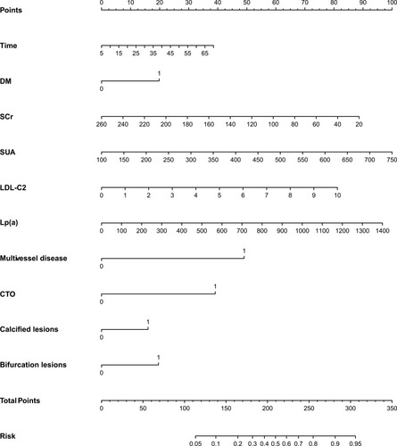
Figure 3 ROC curve of the nomogram for predicting revascularization after PCI in ACS patients. (A) ROC curve in the training set; (B) ROC curve in the validation set.
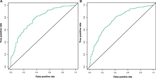
Figure 4 Calibration curve of the nomogram for the training set (A) and the validation set (B). The X-axis represents the overall predicted probability of revascularization after PCI and the Y-axis represents the actual probability. Model calibration is indicated by the degree of fitting of the curve and the diagonal.
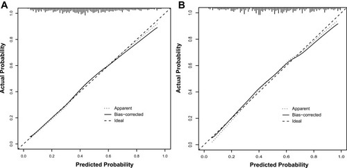
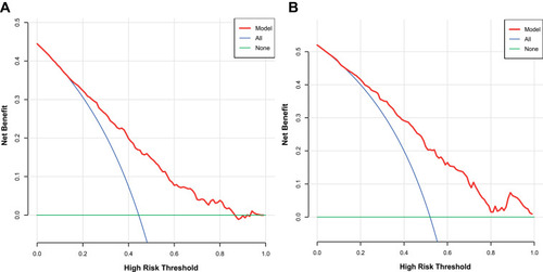
Figure 5 Decision curve analysis for the training set (A) and the validation set (B). A horizontal line indicates that all samples are negative and not treated, with a net benefit of zero. An oblique line indicates that all samples are positive. The net benefit has a negative slope.