Figures & data
Figure 1 Study flow chart.
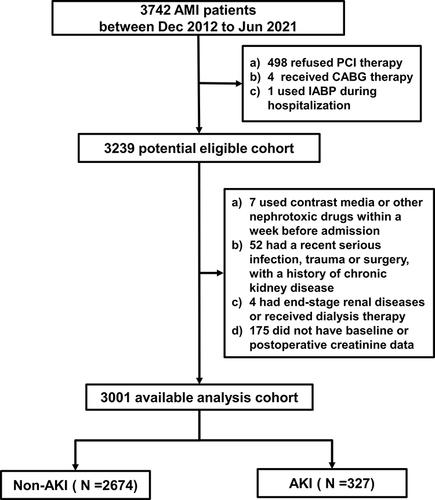
Table 1 Baseline Information of Enrolled AKI Patients and Participants
Figure 2 Neutrophil percentage levels in different groups and the relation of neutrophil percentage with the risk of AKI in a restricted cubic splines model. (A) The violin plot reflects the distribution and probability density of neutrophil percentage levels between the two groups, with dotted lines representing the 25th, 50th, and 75th percentiles. ***P <0.001. (B) The relation of neutrophil percentage with the risk of AKI on a continuous scale. X-axis represents neutrophil percentage. Y-axis represents the probability of AKI. Dashed lines indicate 95% CI. From left to right, the triangles indicate the 25th, 50th, and 75th percentile. (C) The relation between neutrophil percentage and the risk of AKI by restricted cubic splines. The odds ratio is indicated by the solid blue line, and the 95% CI is represented by the shaded regions derived from the three-node restricted cubic spline regression. The horizontal reference line represented by a dashed line indicates a odds ratio of 1.0, and the vertical reference line is the corresponding neutrophil percentage at this time.
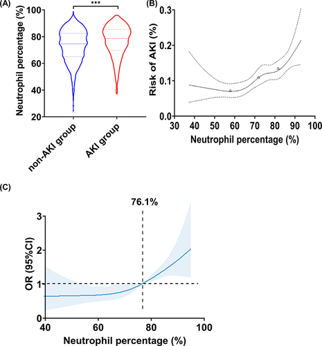
Table 2 Medication and Procedural Characteristics of Enrolled AKI Patients and Participants
Table 3 Multivariable Logistic Regression Analysis of Risk of AKI in Entire Population
Table 4 Neutrophil Percentage Level and Risk of AKI in Entire Population
Figure 3 Survival analyses according to neutrophil percentage quartiles and the incidence of AKI. (A) Short-term survival rate according to neutrophil percentage quartiles (Q1 versus Q2 and Q3 and Q4); (B) Survival rate between AKI group and non-AKI group.
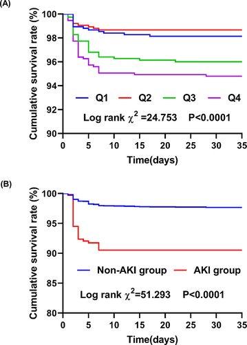
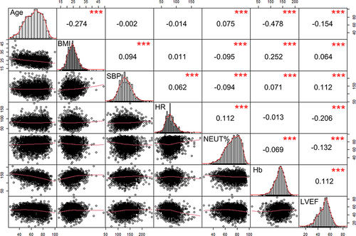
Figure 4 Correlation of variables in AMI patients. The diagonals show the distribution; the lower left part shows a two-variable scatter diagram with fitting lines; the upper right shows the correlation coefficient and significance level, and the numbers represent the correlation coefficient. ***P < 0.001.