
Figures & data
Figure 1 Flow diagram of study selection.
Abbreviations: BCa, breast cancer; BPs, bisphosphonates; CBCa, contralateral breast cancer.
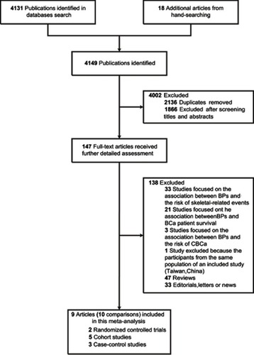
Figure 2 Forest plot for the association between bisphosphonates and primary breast cancer risk. Square markers indicate effect sizes of each study; horizontal lines, the 95% CI. The diamond data marker indicates the summarized effect size. The vertical solid line indicates the overall pooled effect. Note that the studies are ranked in order of their relative weights from random effects analysis.
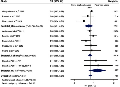
Table 1 The pooled association between bisphosphonates and breast cancer risk