Figures & data
Figure 1 Flowchart representing the selection process of including studies published between 1993 and July 2019.
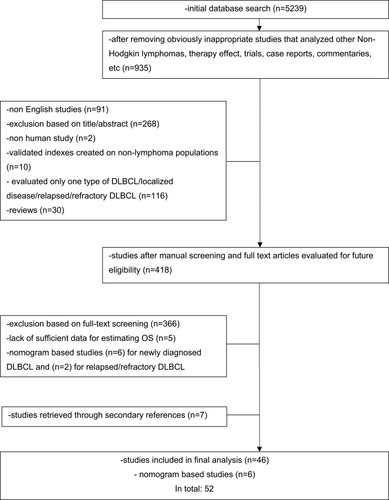
Figure 2 Graph showing an increasing number of reported studies over the past two decades.
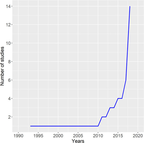
Table 1 Summary of Characteristics (Number of Patients, 3-Year OS Per Risk Category, Difference/Ratio Between High- and Low-Risk Groups, and Additional Statistics Used to Compare Novel Model and Previously Developed Models) of Studies that Reported Four-Risk Categorization Prognostic Model
Table 2 Summary of Characteristics (Number of Patients, 3-Year OS Per Risk Category, Difference/Ratio Between High- and Low-Risk Groups, and Additional Statistics Used to Compare Novel Model and Previously Developed Models) of Studies that Reported Three-Risk Categorization Prognostic Model
Table 3 Summary of Characteristics (Number of Patients, 3-Year OS Per Risk Category, Difference/Ratio Between High- and Low-Risk Groups, and Additional Statistics Used to Compare Novel Model and Previously Developed Models) of Studies that Reported Two- and Five-Risk Categorization Prognostic Model
Table 4 Summary of Characteristics (Number of Patients, Additional Statistics Used to Compare Novel Model and Previously Developed Models) of Studies that Used Nomograms
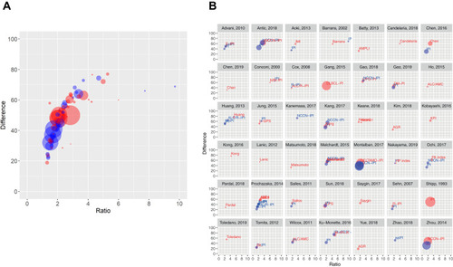
Figure 3 Graphical presentation of difference and ratio between high- and low-risk groups of novel models (red circles) and previously reported (compared) models (blue circles). (A) Difference/ratio presentation of all models and (B) each study. Ratio is presented on the x-axis, while difference is presented on the y-axis and is expressed in percentages. Larger circles indicate a larger study population, while the closeness to the right upper point indicates a bigger difference and ratio between compared groups.