Figures & data
Figure 1 Flow diagram of the selection strategy.
Notes: The search flow diagram summarizes the search, screening, retrieval, and evaluation of articles finally included in the network meta-analysis.
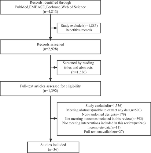
Figure 2 Network of eligible comparisons for in-hospital mortality, adverse event, recovery time, and improvement in SpO2.
Notes: The figure plots the network of eligible direct comparisons for in-hospital mortality (36 studies) (A), adverse event (23 studies) (B), recovery time (8 studies) (C), and improvement in SpO2 (9 studies) (D). The width of the lines is proportional to the number of trials comparing each treatment pair, and the size of each node is proportional to the number of randomized participants.
Abbreviations: IVM, Ivermectin; FVP, favipiravir; CQ, chloroquine; LPV/RTV, lopinavir and ritonavir; HCQ, hydroxychloroquine; HCQ+ AZT, hydroxychloroquine plus azithromycin; SOC, standard of care; SpO2, peripheral capillary oxygen saturation.
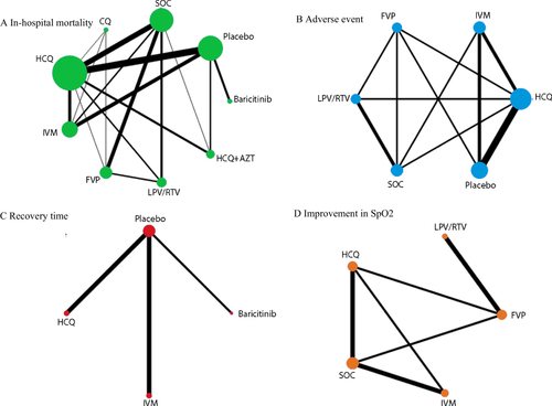
Table 1 League Table of Network Meta-Analysis Results of Interventions for In-hospital Mortality(A), Adverse Event(B), Recovery Time(C), and Improvement in SpO2 (D)
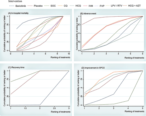
Figure 3 Ranking of treatment strategies based on probability of their protective effects on outcomes of in-hospital mortality (A), adverse event (B), recovery time (C), and improvement in SpO2 (D) by cumulative ranking area (SUCRA). Greater probability, stronger protective effects.
Notes: Graphs show the cumulative probability of each intervention ranking, from best (rank 1) to worst (rank 8, 6, 5 or 3 depending on the number of treatments) for each outcome. A ranking indicates the probability that an intervention is best, second best,etc. For example, baricitinib ranked best for reducing in-hospital mortality, while no intervention ranked worst.
Abbreviations: IVM, Ivermectin; FVP, favipiravir; CQ, chloroquine; LPV/RTV, lopinavir and ritonavir; HCQ, hydroxychloroquine; HCQ+ AZT, hydroxychloroquine plus azithromycin; SOC, standard of care; SpO2, peripheral capillary oxygen saturation.