Figures & data
Table 1 Demographic And Clinicopathological Characteristics Of The Patients In The Training Cohort And Validation Cohort
Figure 1 Selection of patients included in the study.
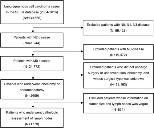
Figure 2 Kaplan-Meier curves of overall survival (A) and cancer specific survival (C) stratified by lymph node ratio (LNR) in the training cohort; overall survival (B) and cancer specific survival (D) stratified by LNR in the validation cohort.
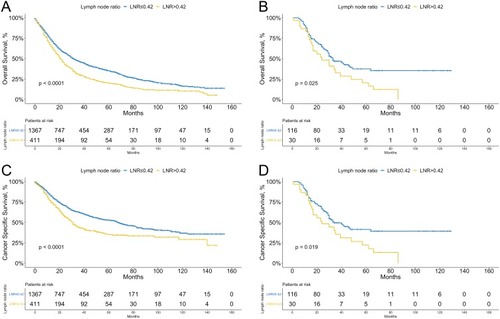
Figure 3 Overall survival according to the recipient of postoperative radiotherapy in patients with lower (≤0.42, A) and higher (>0.42, B) LNR.
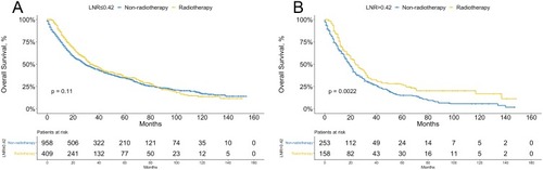
Table 2 Univariate And Multivariate Analysis Of Prognostic Factors Potentially Correlated With OS And CSS Of Patients With Resected N2 Stage Lung Squamous Cell Carcinoma In The Training Cohort
Figure 4 Nomogram for patients with resected N2 stage lung squamous carcinoma derived from the training cohort. After summing up the total score and locating it on the Total Points scale, a line drawn straight down to the 1-, 3-, 5-year Survival scale shows the survival probability at each time points.
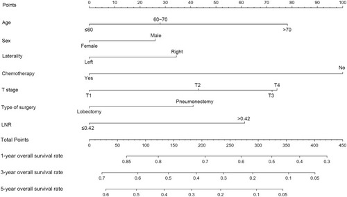
Figure 5 Calibration curves for 1-, 3-, 5-year survival probabilities in the training cohort (A, B, C) and in the external validation cohort (D, E, F). Nomogram-predicted survival is plotted on the x axis and observed survival on the y axis. The vertical bars at the top represent the frequency of the predicted probability of survival. A plot along the 45-degree gray line indicates a perfect calibration model where the predicted probabilities are identical to the actual proportions.
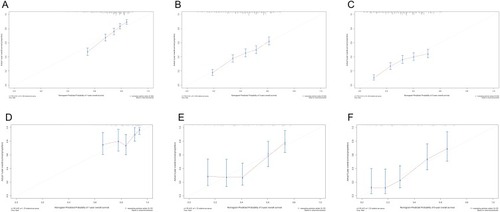
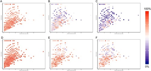
Figure 6 Heatmaps of the number of positive lymph node (x axis) and lymph node ratio (y axis) corresponding to 1-, 3-, 5-year overall survival probabilities (A, B, C) and cancer specific survival (D, E, F).