Figures & data
Table 1 Baseline Characteristics Of GBC Patients
Figure 1 Optimal cut-off values for NLR (A), dNLR (B), PLR (C) and LMR (D) were applied with ROC curves for OS.
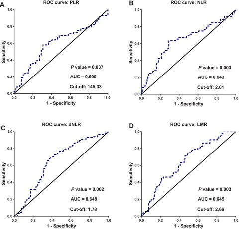
Table 2 Associations Of Inflammation-Based Markers With Clinicopathologic Characteristics Of GBC Patients
Figure 2 Kaplan-Meier curves for cumulative OS of the study population (A) and OS of patients stratified according to tumor differentiation (B) and TNM stage (C).
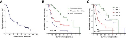
Figure 3 Kaplan-Meier curves for overall survival probability according to the preoperative NLR (A), dNLR (B), PLR (C), and LMR (D), respectively.
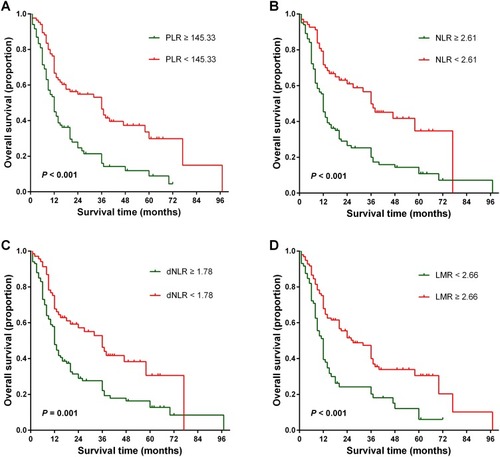
Table 3 Univariate Cox Proportional Hazards Regression Analysis For Overall Survival (OS) In Patients With Gallbladder Carcinoma (GBC)
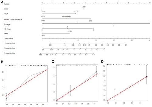
Figure 4 Nomogram for predicting 1-, 3-, and 5-year OS of GBC patients after radical cholecystectomy (A). Calibration plot of the nomogram for 1-year (B), 3-year (C), and 5-year survival (D). The red line represents the “ideal” line of a perfect match between predicted and observed survival. The black line indicates the performance of the proposed nomogram. The X-axis is nomogram predicted probability of survival and Y-axis is actual survival. Black dots are sub-cohorts of the data set; vertical bars represent 95% confidence interval.