Figures & data
Figure 1 The schematics of the decision tree (A) and the Markov state transition model (B).
Abbreviations: NSCLC, non-small cell lung cancer; EGFR, epidermal growth factor receptor; M+, mutation-positive; M-, mutation-negative; Markov model.
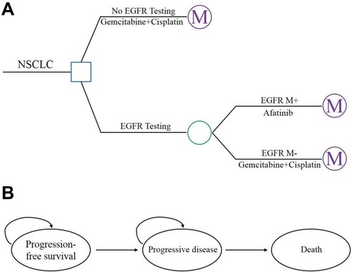
Table 1 Unit Costs Included In The Model
Table 2 Utility Values For The Health States And Disutility Values Associated With Adverse Events And Route Of Administration
Table 3 Summary Of The Cost And Outcome Results In Base-Case Analysis
Figure 2 One-way sensitivity analyses show the lower and upper values for the cost-effectiveness ratio of the Afatinib strategy to the GemCis strategy for each parameter without PAP (A) and with PAP (B).
Abbreviation: PAP, patient assistance program.
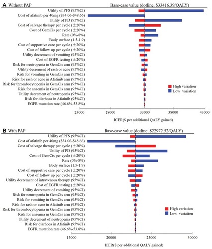
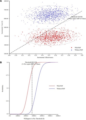
Figure 3 (A) A probabilistic scatter plot of the incremental cost-effectiveness ratio (ICER) between the GemCis and Afatinib strategies for a cohort of 1,000 patients. Each dot represents the ICER for 1 simulation. An ellipse surrounds 95% of the estimates. Dots that are located below the ICER threshold represent cost-effective simulations for the active strategy compared with the control strategy. (B) The cost-effectiveness acceptability curves showing the probabilities of net benefits achieved by the Afatinib strategy compared to the GemCis strategy at different WTP thresholds in advanced NSCLC patients.