
Figures & data
Table 1 Baseline and Clinical Characteristics Between Two Groups Before and After Propensity Score Matching
Figure 1 Plot of the propensity score-matched study before and after matching. (A) Dot plot of standardized mean difference; (B) jitter plot of individual cases; (C) histogram of standardized mean differences.
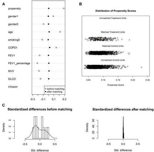
Table 2 The Outcomes and Postoperative Pulmonary Complications Rate Between Two Groups Before and After Propensity Score Matching
Table 3 Clinical Characteristics Between PPCs Group and Non-PPCs Group After Propensity Score Matching
Table 4 Multivariable Analysis of Risk to PPCs After Propensity Score Matching