Figures & data
Table 1 Clinical Characteristics of the Enrolled Participants in Discovery Phase
Figure 1 Study design and flow diagram.
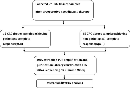
Figure 2 OS and PFS of pCR group were obviously longer than NpCR group. Kaplan–Meier curves for colorectal cancer-progression-free survival (A). Kaplan–Meier curves for colorectal cancer-overall survival (B).
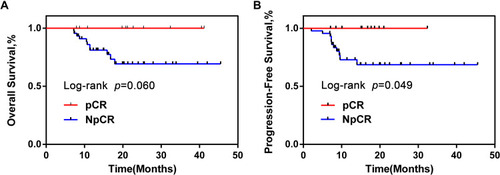
Figure 3 Microbial community richness and Alpha diversity in pCR and NpCR tumor tissues. (A) Venn diagrams. The Venn diagrams represent the shared and unique taxa among the different tissues. The microbial diversity, as estimated by the ACE index (B), Chao1 index (C), Shannon index (D) and Simpson index (E), in the both groups was significant. **p < 0.01; ***p < 0.001.
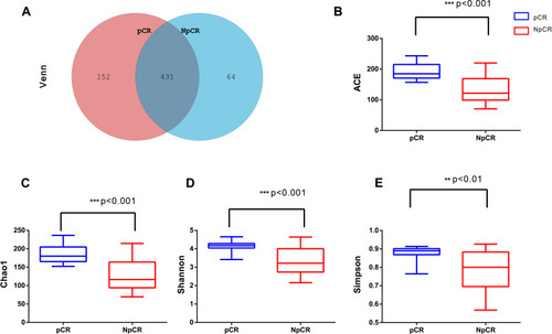
Table 2 Beta Diversity Assessed by Weighted and Unweighted UniFrac Distances
Figure 4 Beta diversity assessed by NMDS analysis in pCR and NpCR tissues. NMDS analysis (non-metric multi-dimensional scale) analysis. The dots represent individual samples. The distance of the sample point represents the similarity of the microbial community in the sample. The closer the distance is, the higher the similarity. (A) Unweighted UniFrac PCoA plots; (B) weighted UniFrac PCoA plots. NpCR group (red dots); pCR group (blue dots).
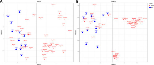
Figure 5 Profiles of microbial taxonomic composition at the phylum and genus levels. Compositions of tissue microbiota at the phylum level (A) and genus level (B) between pCR and NpCR tumor tissues.
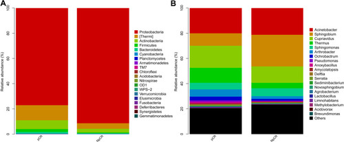
Figure 6 Profiles of differential microbial communities at the phylum and genus levels. The increased microbial communities at the phylum level in pCR tumor tissues versus NpCR tumor tissues (A). The increased microbial communities at the genus level in pCR tumor tissues versus NpCR tumor tissues (B). *p < 0.05; **p < 0.01; ***p < 0.001.
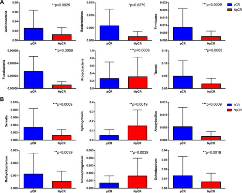
Figure 7 The microbial taxa between pCR and Non-pCR tumor tissues at the phylum and genus levels and the distribution bar chart of LDA values. The distribution bar chart of LDA values shows the species with LDA scores greater than the set value and the species with significantly different abundances in different groups. The length of the histogram represents the size of the impact of significantly different species (A–C).
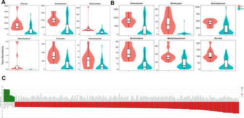
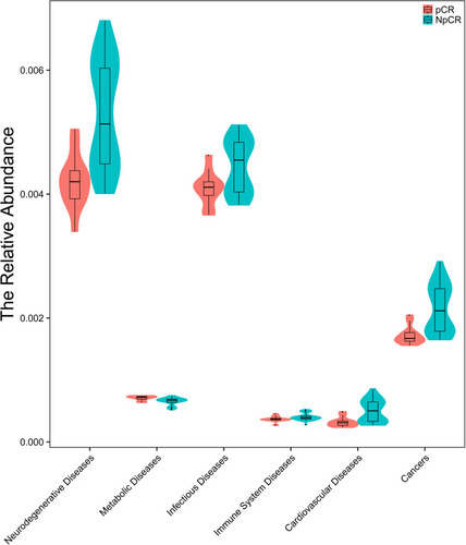
Figure 8 Microbiota correlation network analysis. The relative abundance of neurodegenerative disease, metabolic disease, infectious disease, immune system disease, cardiovascular disease and cancer were significantly lower in pCR group than in non-pCR group.