
Figures & data
Table 1 Baseline Characteristics of the Study Participants in the Training and Validation Cohorts
Table 2 Univariate and Multivariable Cox Proportional Hazard Analyses of the Training Cohort
Figure 1 Nomogram of the D-index for predicting the overall survival after curative resection of PHCC. The scores of each variable were added to obtain the total score, and a vertical line was drawn on the total score to obtain the corresponding survival probability.
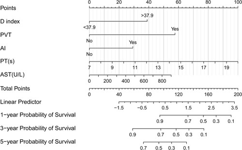
Figure 2 Results of using X-tile analysis by total risk score calculated by the nomogram scoring system in the training cohort.
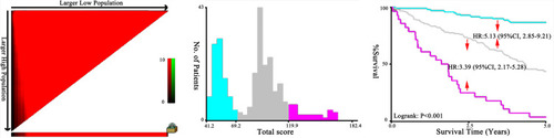
Figure 3 Survival curves stratified by total risk score (low risk: < 69.2; medium risk: 69.2–119.9; and high risk: ≥ 119.9) in the validation cohort.
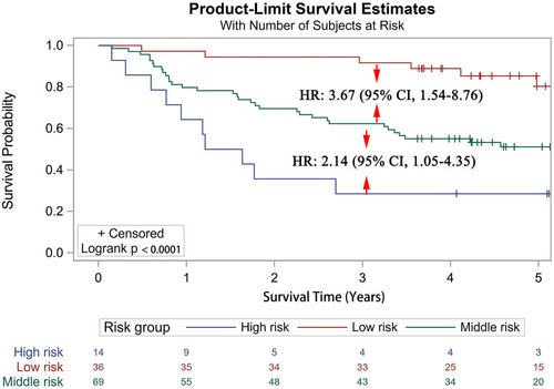
Figure 4 Calibration curves for predicting the overall survival rate by nomogram scoring system in the training and validation cohorts. Calibration curves of the prognostic nomogram for (A) 1-year overall survival, (B) 3-year overall survival, and (C) 5-year overall survival in the training set, and calibration curves for (D) 1-year overall survival, (E) 3-year overall survival, and (F) 5-year overall survival in the validation set.
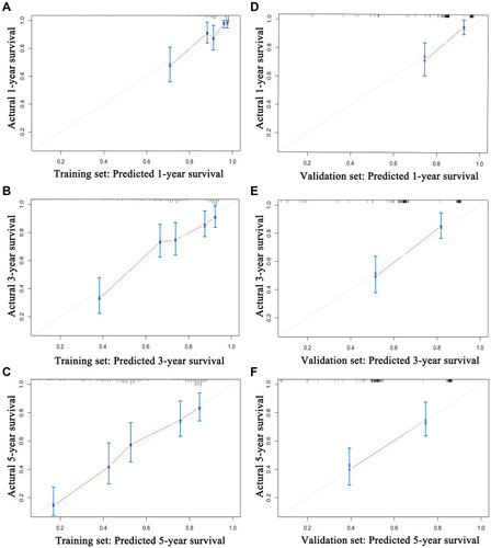
Figure 5 ROC curve of the D-index, prognostic nomogram, CLIP, TNM, Child–Pugh, BCLC, Okuda system, and combined group in the training cohort. ROC curve for (A) 1-year survival, (B) 3-year survival, and (C) 5-year survival. The combined group included the CLIP, TNM, Child–Pugh, BCLC, and Okuda.
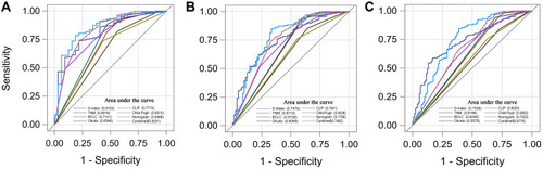
Figure 6 DCA curve of the D-index, TNM, BCLC, Okuda, CLIP, and prognostic nomogram in the training cohort. The horizontal axis represents the threshold value, which is the reference probability of whether a patient receives treatment, and the vertical axis represents the net benefit rate after the advantages minus the disadvantages. Under the same threshold probability, the larger net benefit implies that patients can obtain the maximum benefit using the diagnosis of this model. The closer the curve in the DCA graph to the top, the higher the value of the model diagnosis.
