Figures & data
Table 1 Clinical and Pathological Characteristics in 375 Eligible NSCLC Patients and 201 Control Subjects
Figure 1 The correlation between target parameters and tumor stage in NSCLC patients. These graphs show the relationship between LY% and tumor stage in NSCLC (A and D). These graphs show the relationship between FIB and tumor stage in NSCLC (B and E). These graphs show the relationship between FLR and tumor stage in NSCLC (C and F). **P < 0.001.
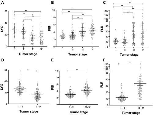
Table 2 Comparisons of Pretreatment Circulating LY%, FIB, and FLR in Different Variables Among NSCLC Patients
Table 3 Univariate and Multivariate Analysis of Cox Regression Model for Candidate Prognostic Factors for 209 NSCLC Patients
Figure 2 The optimal cutoffs values of LY% (A–C), FIB (D–F), and FLR (G–I) in 375 NSCLC patients by using X-tile software. Data is graphically represented as a right-angled triangle grid, where each point represents data from a given set of partitions. These graphs show the generated χ2 log-rank values and divide them into three or two groups according to the cutoff points (A, D and G). Determining the optimal cut points (17.8, 3.4, and 16.8) by locating the brightest pixels on the x-tile map. The number of patients was represented by histogram (B, E and H). The corresponding population was represented by Kaplan–Meier curve (C, F and I), respectively.
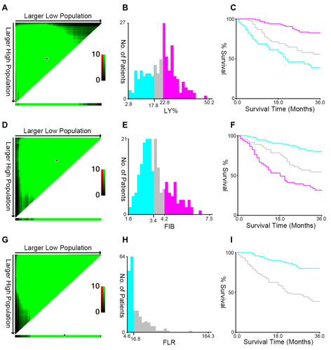
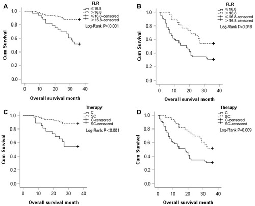
Figure 3 Kaplan–Meier curves of 209 NSCLC patients with treatment of chemotherapy (C therapy) or surgery combined with chemotherapy (SC therapy). (A) Kaplan–Meier curve for overall survival probability within NSCLC patients receiving SC therapy according to circulating FLR concentration. (B) Kaplan–Meier curve for overall survival probability within NSCLC patients receiving C therapy according to circulating FLR concentration. (C and D) Kaplan–Meier curve for overall survival probability within NSCLC patients according to two therapy methods in low FLR group and high FLR group, respectively.