Figures & data
Table 1 Clinical Characteristics of the Included 285 COAD Samples
Figure 1 Co-methylation analysis using WGCNA. (A) Network topology for different soft-thresholding powers (left panel, the red line represents a scale-free fit index of 0.9) and mean connectivity values (right panel, the red line represents a mean connectivity of 1). (B) Clustering dendrograms of genes and module colors, in which 11 co-methylation modules with different colors were constructed. (C) Module–trait associations. Each row represents a module eigengene, and each column represents a clinical feature. Each cell contains the corresponding correlation coefficient and p value. (D) Venn plot of the differentially methylated genes (DMGs) in the WGCNA modules that overlapped with differentially expressed genes after DMG mapping to the WGCNA modules. (E) Histogram showing the enrichment-fold value of the different modules.
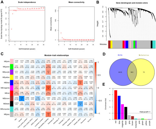
Figure 2 Correlation analysis and functional enrichment. (A) Correlation scatter plot showing the overall correlation between the methylation level and expression level. (B) Pie chart showing the significantly enriched KEGG pathways. (C) Bubble diagram showing the significantly enriched Gene Ontology biological processes.
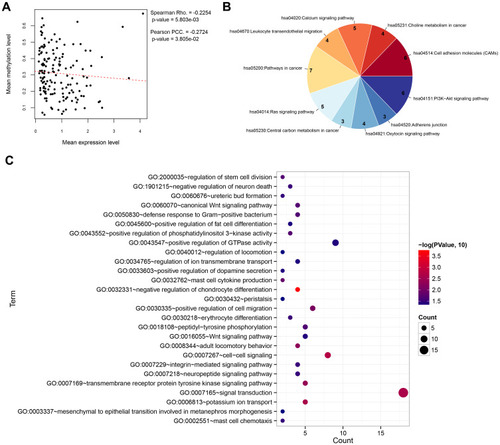
Table 2 The 10 Optimal DMGs Signatures Screened by Cox-PH Model
Figure 3 Predictive performance of the prognostic score model. Prognostic score distribution (upper panel), scatter plot of the overall survival time distribution of the samples (middle panel), and heatmaps of the methylation level patterns of the 10 differentially methylated genes with prognostic score changes (lower panel) in the training set (A), validation set (B), and entire set (C). Kaplan–Meier survival curves for patients with high and low prognostic scores in the training set (D), validation set (E), and entire set (F). (G) Receiver operating characteristic curves showing the predictive performance of the prognostic score model in the three data sets.
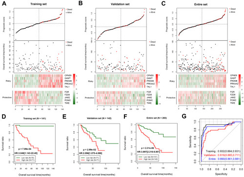
Table 3 Screening of Independent Prognostic Factors by Univariate and Multivariable Cox Regression Analysis
Figure 4 Survival analysis using recurrence as the independent prognostic factor. Kaplan–Meier survival curves for the training set (A), validation set (B), and entire data set (C). The left panel shows the survival status of patients with or without tumor recurrence in the three data sets; the middle panel shows the survival status of patients with a high or low prognostic score in the “recurrence” group; and the right panel shows the survival status of patients with a high or low prognostic score in the “without recurrence” group.
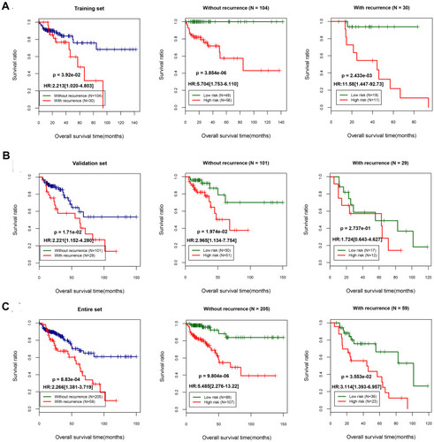
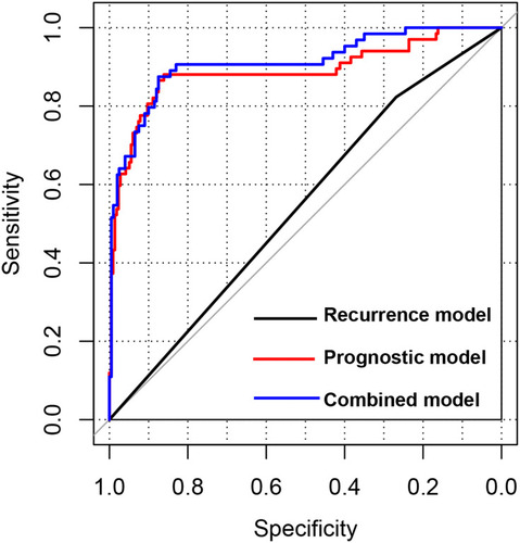
Figure 5 Receiver operating characteristic curves of different prognostic models. The curves show the predictive performances of the recurrence model, prognostic score model, and combined model (recurrence score and prognostic score combined).