Figures & data
Figure 1 Recruitment procedure and study flowchart.
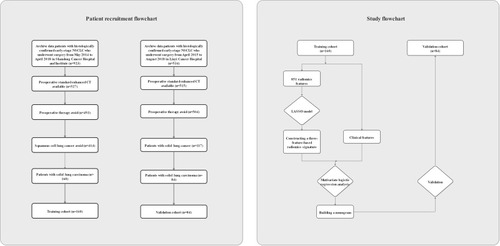
Table 1 Characteristics of Patients in the Training and Validation Cohorts
Figure 2 Radiomics feature reduction and selection using the least absolute shrinkage and selection operator (LASSO) binary model. (A) Selection by the LASSO model utilized 10-fold cross-validation with the minimum criteria. The binomial deviances were plotted against log (lambda). Dotted vertical lines mark the optimal value applying the minimum criteria with 1 standard error (the 1-SE criteria). The optimal λ value of 0.101 with log(λ) =−2.291 was selected. (B) LASSO coefficient profiles of the 357 radiomics features. The vertical line was delineated at the optimal value by 10-fold cross-validation, and 3 features were chosen with nonzero coefficients in the plot.
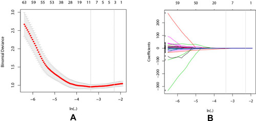
Table 2 The Results of ROC Analysis
Figure 3 ROC curves and calibration curves. (A) ROC curves for training cohort. (B) ROC curve for radiomics signature of validation cohort. (C) Calibration curve of the radiomics model in the training group. (D) Calibration curve of the radiomics model in the validation group. Calibration curves described the calibration of each predictive model as a measure of the agreement between the predicted probabilities of occult lymph node metastasis (OLNM) and the observed result. The y-axis shows the actual OLNM rate, and the x-axis shows the predicted OLNM risks. The diagonal dotted blue line denotes a perfect prediction (ideal model). The red line reveals the actual performance of the nomogram.
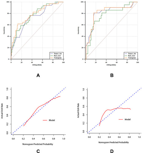
Table 3 Univariable and Multivariable Logistic Regression Analyses for OLN
Figure 4 Radiomics nomogram. The predictive nomogram was built in the training group. Its variables were CT-reported tumor size and Rad-score.
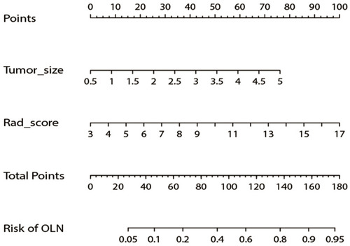
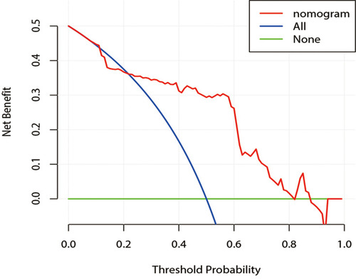
Figure 5 Decision curve analysis for the radiomics nomogram in the validation cohort. The y-axis measures the net benefit, and the x-axis represents the threshold probability. The red line represents the radiomics nomogram. The blue line represents the assumption that all patients have OLNM. The green line represents the assumption that no patients have OLNM. The decision curve in the validation cohort indicates that if the threshold probability of a patient was between 0.22 and 0.83, the nomogram to predict OLNM showed more benefit than the treat-all therapeutic plan or treat-none plan.